UIStroke
UIStroke applies an outline to text or a UI border. Key features include:
- Change the stroke Transparency independently from the text or UI object.
- Choose the LineJoinMode of the stroke (round, bevel, or miter).
- Add a gradient to the stroke via the UIGradient instance.
- Use rich text tags to add stroke to inline text segments.
For more details on the UIStroke object, see Appearance Modifiers.
Summary
Properties
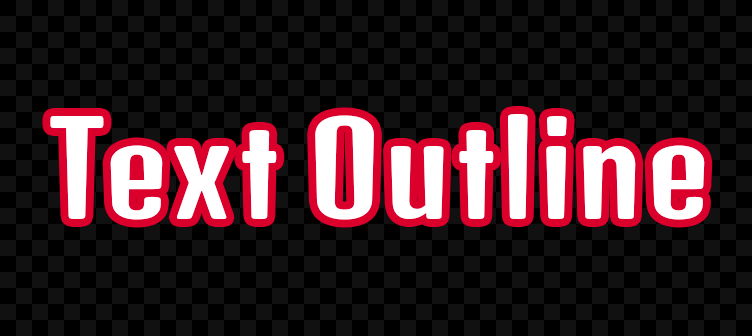
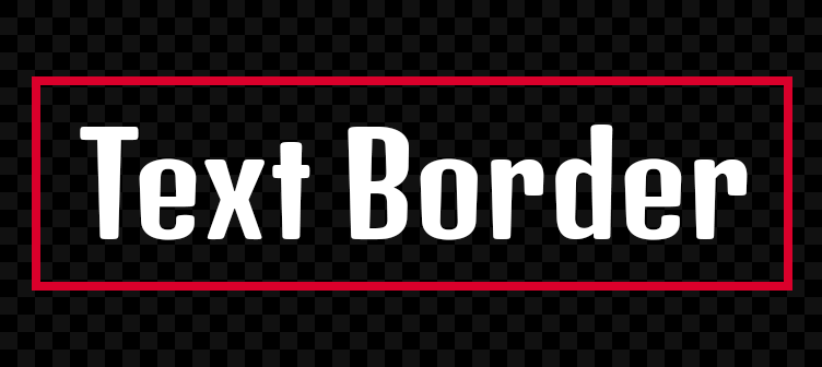
Determines whether to apply the stroke to the object's border instead of the text itself.
Determines the stroke color.
Determines whether the stroke in visible.
Determines how corners are interpreted.
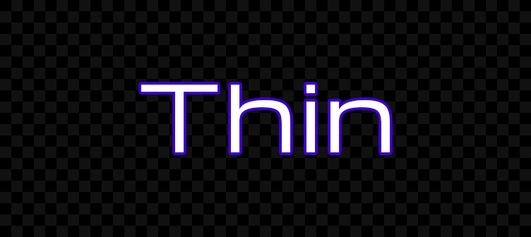
Determines the stroke's thickness.
Sets the stroke opacity independently of the parent object's BackgroundTransparency or TextTransparency.
Properties
ApplyStrokeMode
When a UIStroke instance is applied to a text object, this property determines whether to apply the stroke to the object's border instead of the text itself.
Color
Determines the UIStroke color. You can also insert a UIGradient instance as a child to create gradient strokes.


Enabled
This property determines whether the UIStroke is visible. When set to false, the stroke will not be rendered. Defaults to true.
LineJoinMode
This property determines how corners are interpreted. It accepts an Enum.LineJoinMode value of either Round (default), Bevel, or Miter.


Thickness
This property determines the stroke's thickness, measured in pixels from the parent's outer edges.

Be mindful of tweening this UIStroke property when applied to text objects. This renders and stores many glyph sizes each frame, potentially causing performance issues or text flickering.
Transparency
This property sets the stroke opacity independently of the parent object's BackgroundTransparency or TextTransparency. This allows you to render text and borders that are "hollow" (consisting of only an outline).