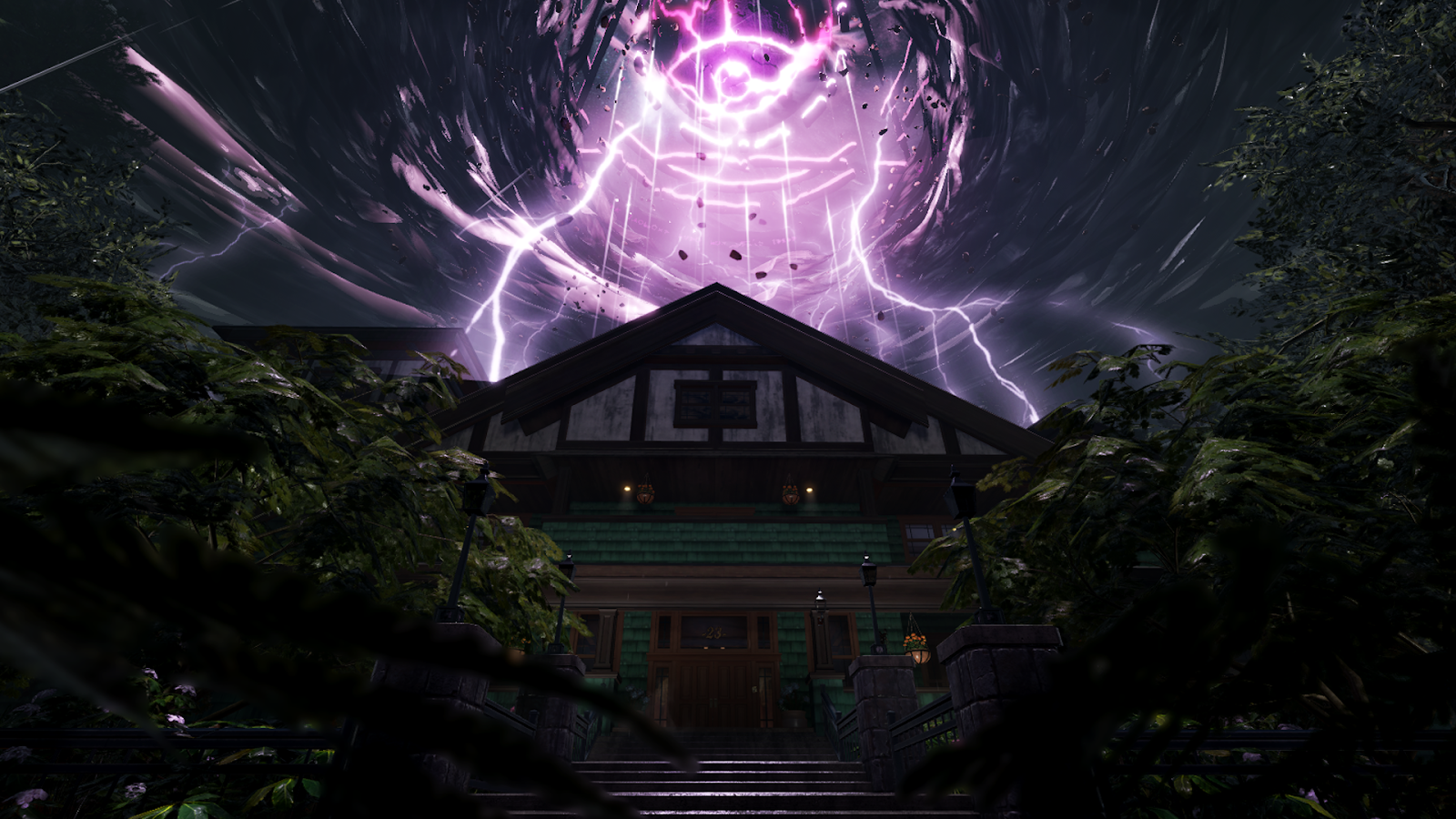
Roblox Studio is a powerful engine that can create experiences on a wide variety of platforms, but even some high-end phones may struggle to load all of our content at once. To address this, we used streaming to achieve the highest level of quality possible on a wide spectrum of devices. Streaming allowed us to author all our content in one place and dynamically load smaller portions of the content visible to the user.

Technical Considerations
When enabling streaming on your experience, there are a few things to consider to ensure that your experience runs well and that you maximize the benefits of the streaming feature:
- Are there scripts or elements that are reliant on another piece of content? If so, one or more of your dependencies may not be loaded at certain times.
- Are there scripts that scan the workspace when the experience starts? Client scripts should not rely on finding all instances they require at the time an experience starts and this is not a recommended practice.
- Does your experience suffer visually if some content doesn't display at the correct time? There are various techniques and tricks to create a streaming-friendly environment and ways to use perspective to your advantage.
When creating The Mystery of Duvall Drive, we encountered all three of these problems and were able to work around them by using a combination of careful script design and cleverly applied set dressing and world layout. When working with streaming on your own experience, remember you can tune your streaming min/max distance to what suits your experience and adjust a variety of highly customizable options.


Streaming-Friendly Level Design
To create an immersive environment, players have to be consistently surrounded by the world we built for them. When using instance streaming, we had to make sure that players wouldn't see unexpected content, such as seeing the "end of the world" if there weren't any visual assets loaded in their instance streaming range.
Since distant trees behind the house and other blocking geometry like hills and mountains would be out of range, we had to find a solution to keep players from seeing the horizon and breaking their immersion. To address this, we added nearby blocking geometry along all areas of the player's path and designed the path that would wind to effectively hide the lack of content in the distance. We placed blocking geometry in a way that ensures the player would be surrounded by streamable visual assets at any point on the path. This aligned well with our original design to create a windy driveway and is a prime example of thoughtful level design that incorporates aesthetic and technical applications.

Playing with Perspective
There are some cases where content that a player would expect to see from far away is too far from the camera, such as our storm in the sky. We wanted players to see this large phenomenon, but it would break the immersion if the sky storm didn't exist when the player was too far away to load the asset. It would also be jarring to see a large asset suddenly load in when the player got close enough to an object that they should've seen further away. We tried to minimize this by playing with perspective and making sure the models in the sky were large enough to be within the bounds of the player's streaming distance.

Another solution was to increase the vertical height of the trees surrounding the player when they weren't close enough to the storm. This solved the situation where the player is too far away to load the asset but would still expect to see it in their line of vision. Big trees are common in our Pacific Northwest setting, and this adjustment helped solve the problem with minimal concessions to our aesthetic and design.
