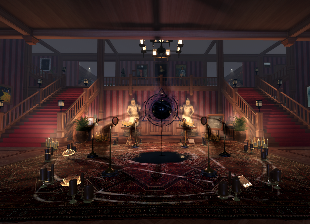
It took many iterations and rapid testing at the beginning of the process to make the house both fun and creepy, easy to explore, and something you want to get lost in. We'll show you how we thought through the space and constructed it using packages to make updating individual chairs and entire rooms faster toward the end.
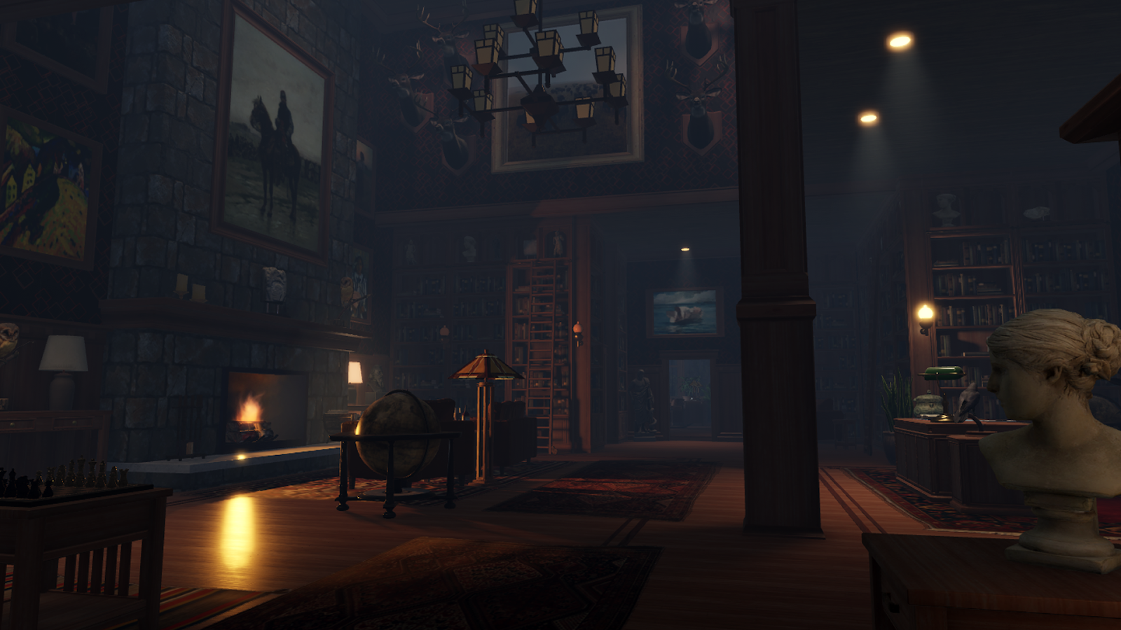
Begin with a 2D layout
Since the house is both the majority of the playable area and an entire character unto itself, we wanted to give a lot of thought about how to make sure it remained both real and fun. We started with the idea that the house should contain several visual and audio gags, lore, and corrupt puzzle rooms, and we wanted players to initially approach the house with little knowledge of what was going on, learning what happened to the house and the family that lived there as they were playing.
To balance all of these important elements, we started imagining the 3D environment with a 2D layout! Starting with figuring out the general story beats, or key moments, we wanted the player to experience, we drew a layout of the space, and thought about how we would guide the player where we wanted them while maintaining an environment that felt larger than life.
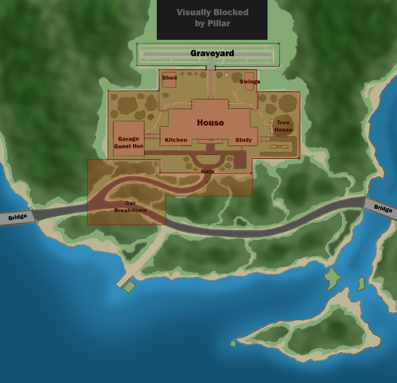
Once we had our early draft of the overall layout, we used terrain to quickly lay out the surrounding hills, lake, road, and the driveway up to the house. We didn't bother with the visual quality of the demo at this point, but instead focused on how long it took to get to the house and what it would take to give the player glimpses of the house and the event in the sky.
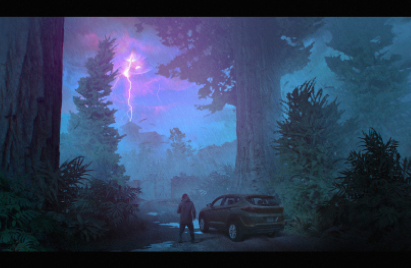
Using both simple parts along with Creator Store assets, we were able to quickly add in content that would help us compose the environment, including:
- Making the road bend so players couldn't see all the way down the length of it.
- Adding trees with denser areas where we wanted to make it clear the player couldn't access, along with thinner areas where we wanted to encourage them to explore.
- Raising the house's driveway so that when players approach it, they would have to climb. This gave the house a more intimidating presence.
- Positioning the giant event behind the storm in the sky so players could see parts, but not the whole thing, until they approach the house itself.
- Placing and figuring out the general shape of the house we ultimately settled with.
No amount of experience guarantees your first ideas are the best ones. This is why we got assets into Studio quickly and used simple parts and Creator Store assets to fill in the environment with temporary assets. This allowed us to not have to make everything up front, and we could start playtesting within the first few days.
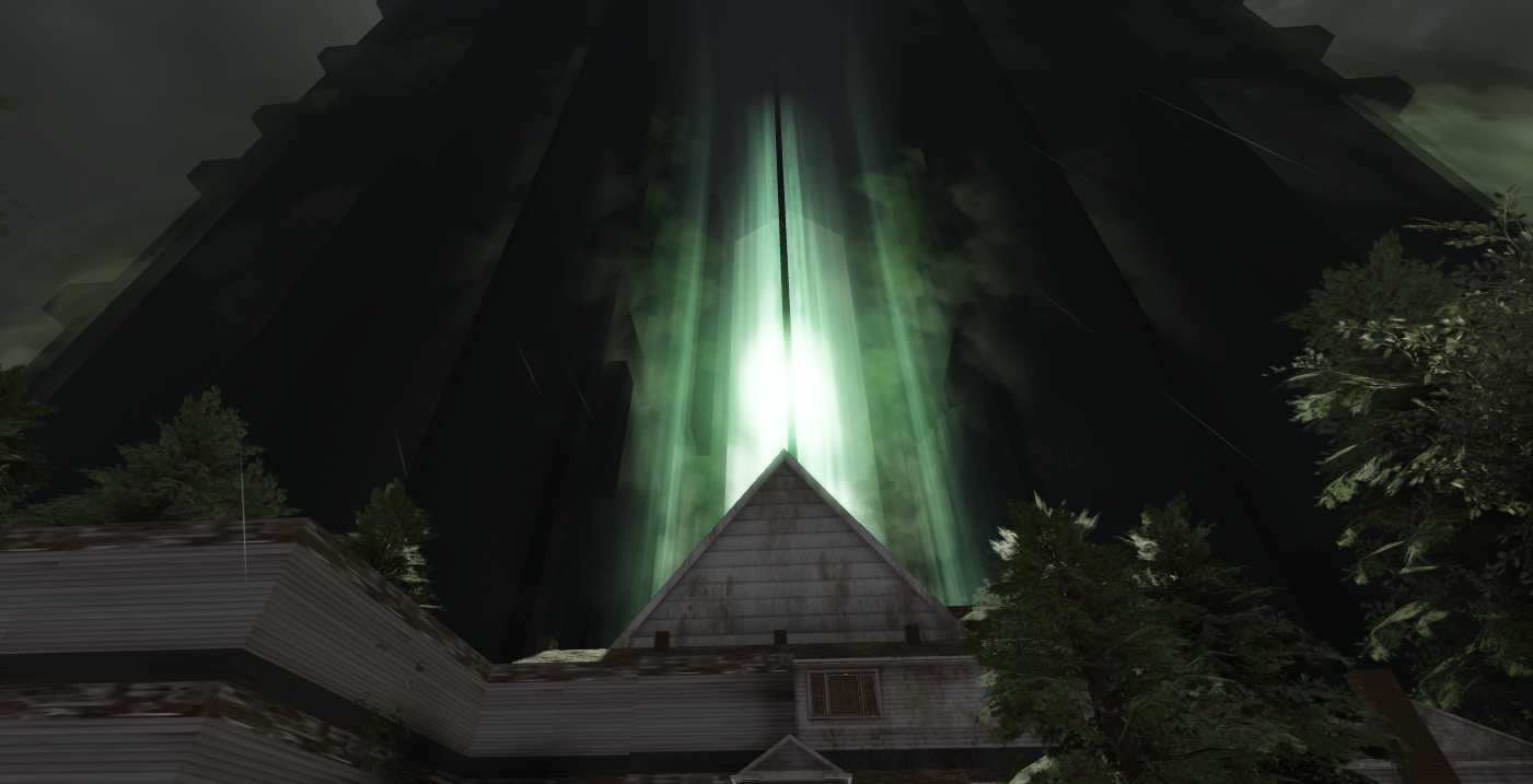
While we wanted to eventually replace the temporary assets with our own, the only thing we cared about early on was laying out the basics and playing the experience to make sure the environment was fun to move around and wasn't too large or too much of a "straight shot" so that players were encouraged to explore.
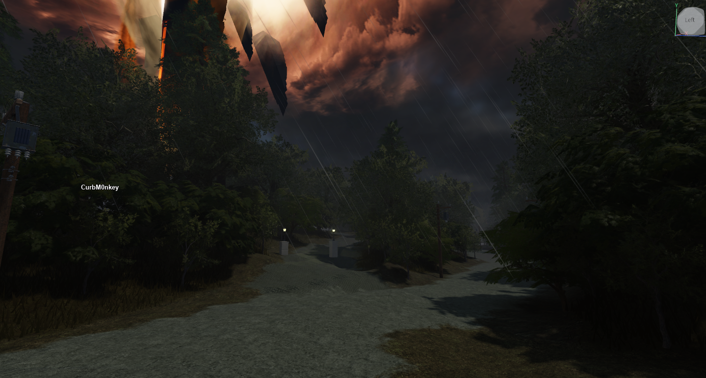
Plan each room
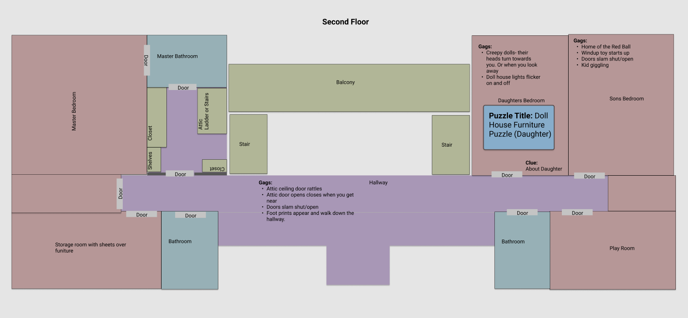
The exterior was only meant to be a taste of the overall story to immerse the player and get them familiar with the world they were playing in. The main character was the house itself, and we wanted players to spend most of their gameplay inside it plumbing for secrets and finding surprises in every room. To do this, we needed to figure out what rooms the house should include, when we wanted players to run into them, and where they should exist within the house. We drew a 2D layout of the house, and the team bounced around ideas for cool things that could happen. No ideas were ignored at this point.
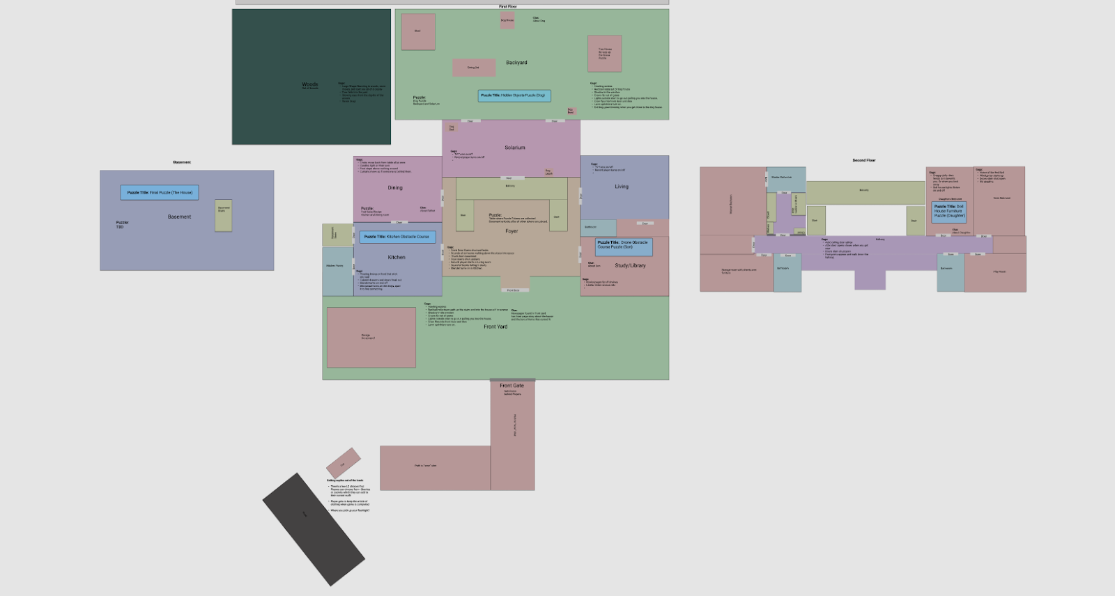
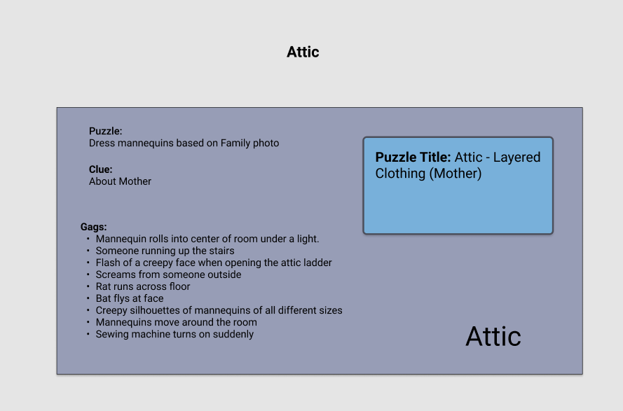
We used 2D boxes of each room to figure out how we wanted to arrange them with each other. Each room should be an opportunity to do something, and we threw around a lot of ideas, including the main uses of each room, what creepy gags we could use to surprise the player, and potential puzzles they could face.
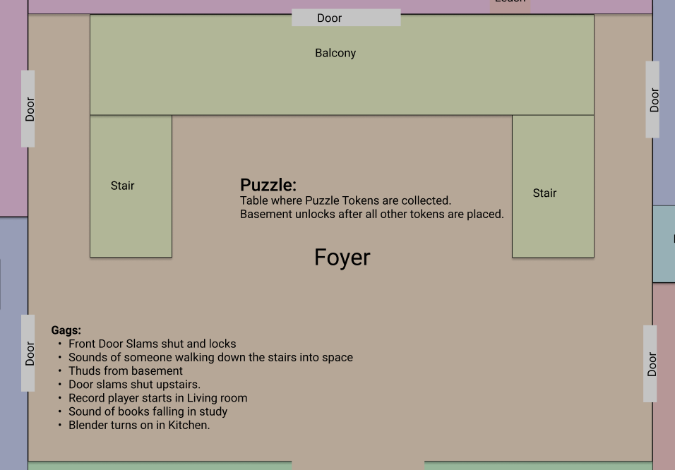
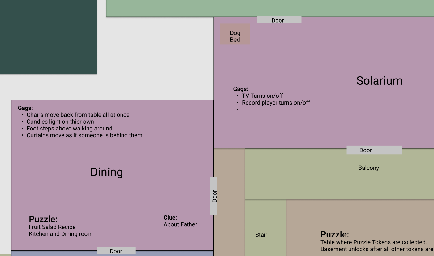
Each room had to work together, and we wanted to tell the story slowly and progressively. We knew we couldn't control where someone went first, so we planned for some of the harder puzzles to be further from the front door and harder to stumble upon. This meant adding a few floors to the house, including an attic and a basement for both gameplay and thematic reasons. Final puzzle in a basement that looks evil and scary? Sign us up!
Build a 3D layout
All the early planning and ideas in the world don't make a fun experience, so it was time to start making the idea 3D! The exterior layout was blocked out and we made space for the house to be expanded or contracted. Earliest iterations were done in another 3D application where we could make simple boxes and shapes to start turning that 2D image into a playable space. You may find that building the early versions in Studio and using simple parts is your favorite method. There's no wrong way, so long as you get your ideas into 3D and playable quickly!
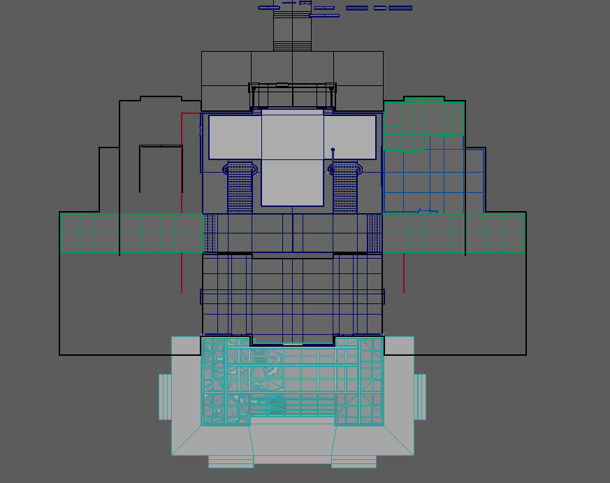
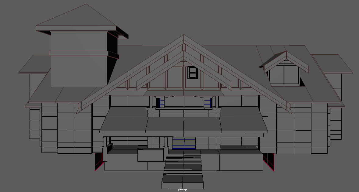
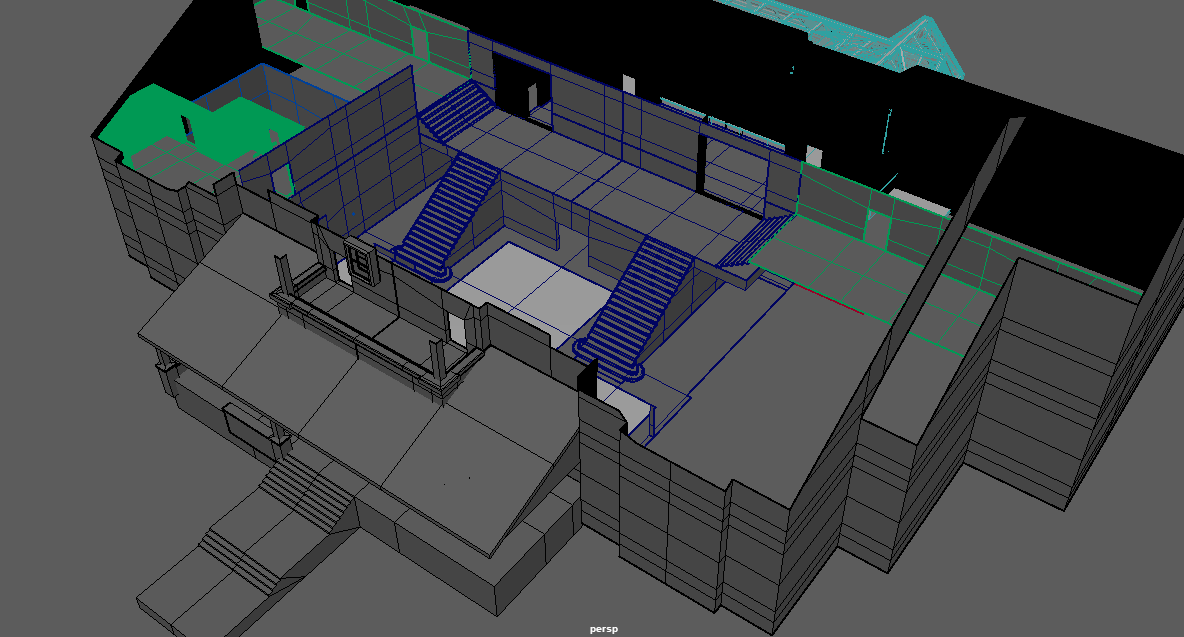
Nothing gets easier as the work gets more complex, so it was important to us to experiment often and figure out the environment structure we wanted to create. The earliest iterations of the house were as simple as the images you see above, and the simple shapes allowed us to be as flexible as possible and quickly make changes to the sizes of the rooms as we played through the demo. Scale was also important early on, so we always built with an avatar both in our 3D application and inside Studio so we could know how big a door or how tall the steps should be.
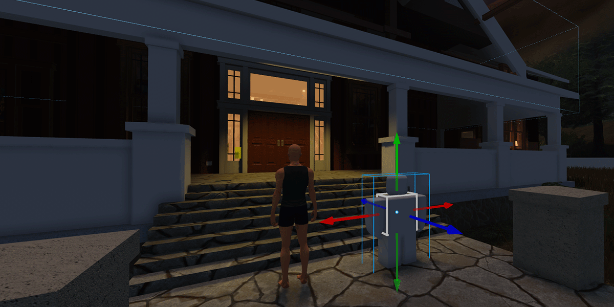
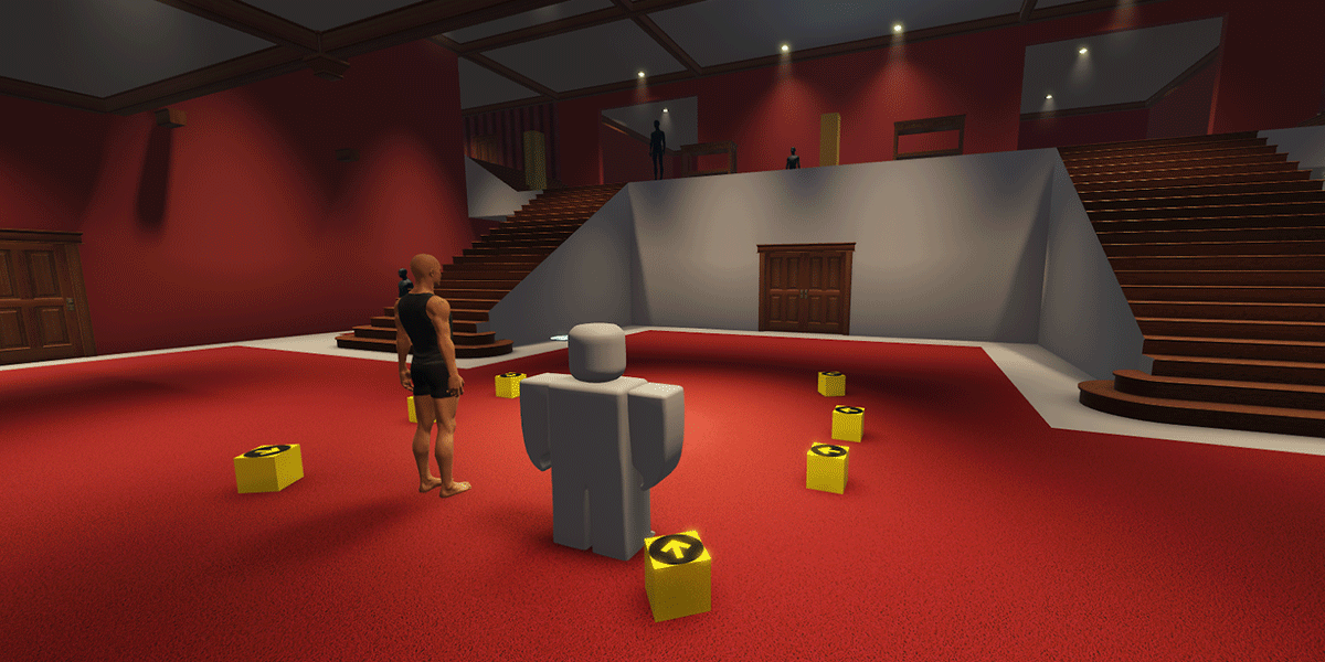
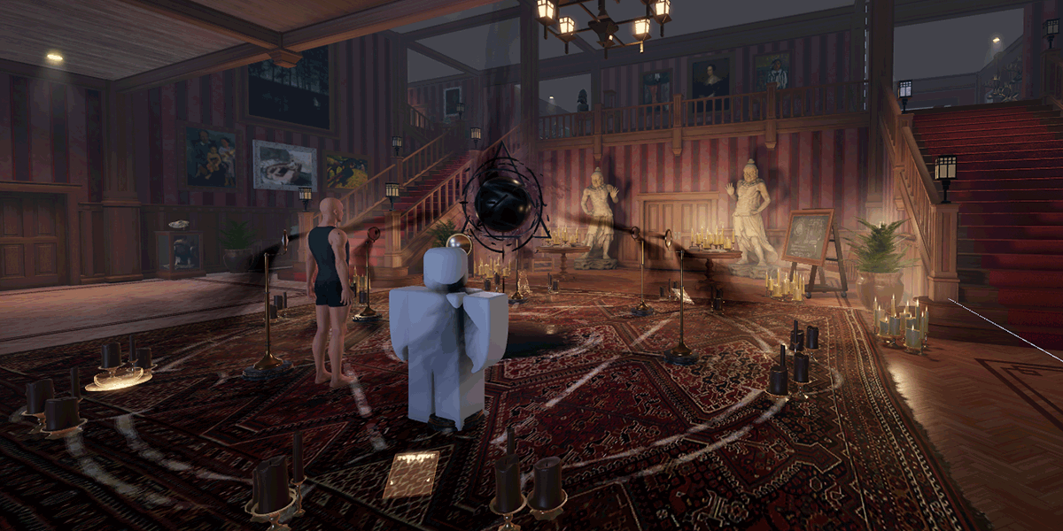
We went through many small and large iterations to settle on what we have in the final demo. Compare the early drafts above with a much later version of the foyer, and you'll see many of the original decisions we made after playing through the house were able to stay!
Furniture and props
We needed a lot of furniture and props to fill a house of this size, so before we started to gray box any of its content, we made a document to track everything we could use that would compliment what type of room it was and the puzzles we were in the process of creating. By getting all of our thoughts down into one spot, we could organize, prioritize, and see where we could reuse content in different rooms. While this was a fair amount of up-front planning, it saved us from either making not enough content or too many unnecessary items.
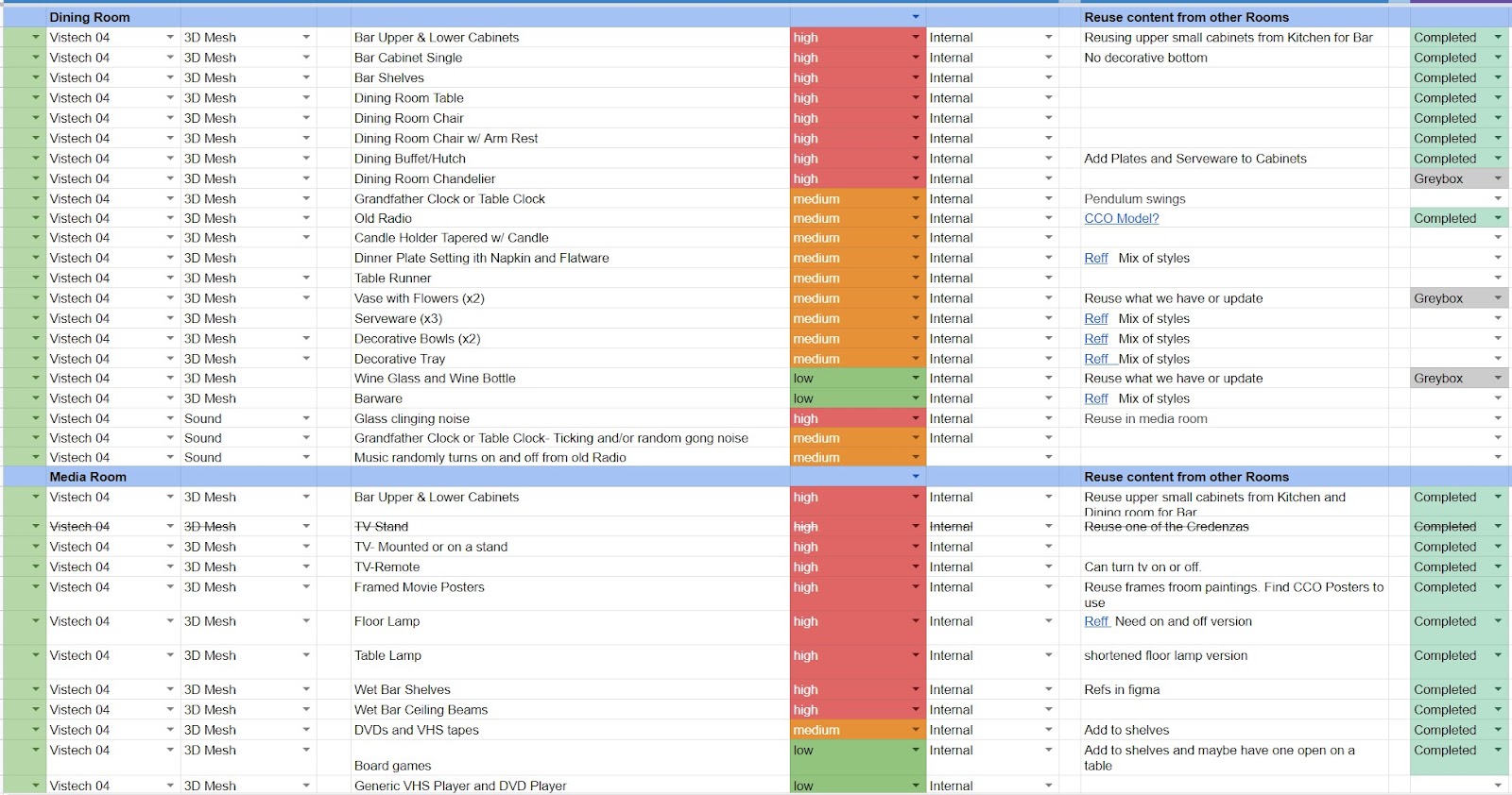
This list gave us a good understanding of what needed to take priority when gray boxing out the content and populating it throughout the house. By adding high-priority content early, we could easily see when assets were repetitious, had incorrect proportions, or when they would need a second variation or a texture swap when they were in certain rooms. Some content we blocked out early on ended up not being important to the experience and removed, but we didn't lose a lot of work in the process since they were only quick blockouts. For all the furniture and props we kept, we made them into packages in their blockout phase, and this made it easier for us to replace everything throughout the house with their final versions.
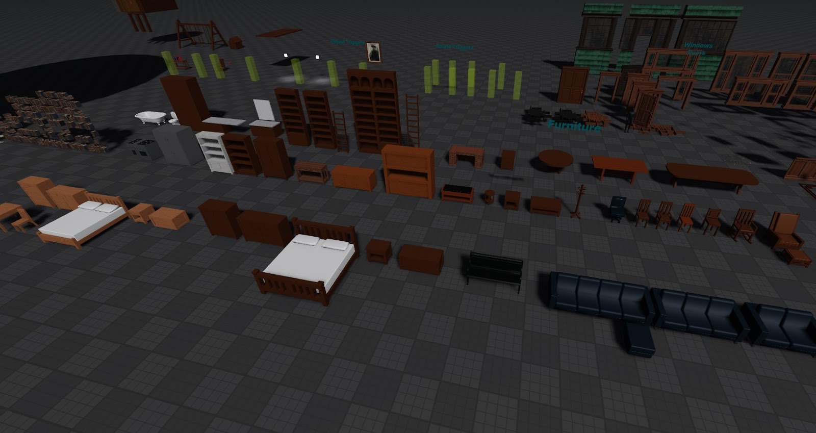
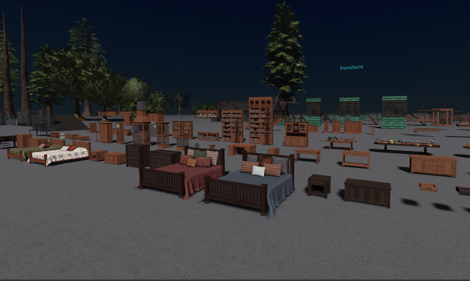
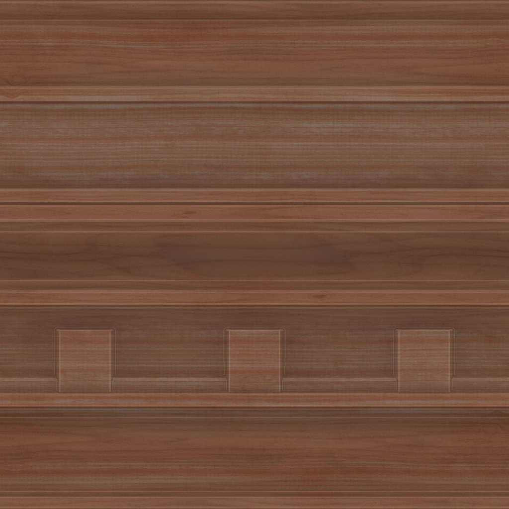
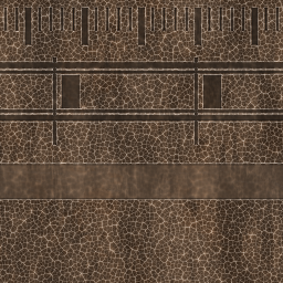
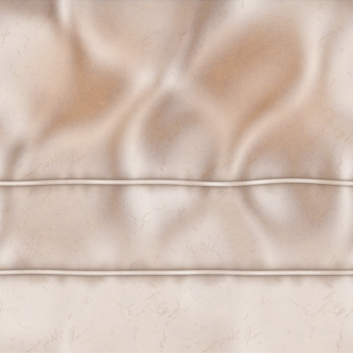
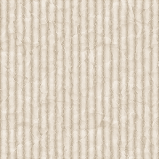
Because of the sheer quantity of assets needed for this demo, reusing textures as much as we could was extremely important for keeping within our memory budget. A lot of the furniture shares the same trim or tileable sheets for wood, metal, stone, glass, and fabric, and we utilized transparent textures wherever we could. For example, we used a transparent texture for fabrics so we could have color variations without having to create a second Albedo texture. For more information on how to reuse textures, see Planning, Reuse, and Budgets.
Photogrammetry
We knew we required a lot more content than we had time to build ourselves, so we decided to speed up the process of creating high-quality content on a 1:1 texture sheet by utilizing photogrammetry sourced from the Creative Commons (CC0). Photogrammetry is the process of capturing hundreds of images of objects from every angle in order to create high-quality models with accurate proportions, and Creative Commons models are mostly free models that are typically educational in nature that you can use and/or share legally. These models can range from hand-modeled assets to assets made from photogrammetry, and working with them in this process made it so we could skip the time-consuming step of creating a detailed high-resolution model.
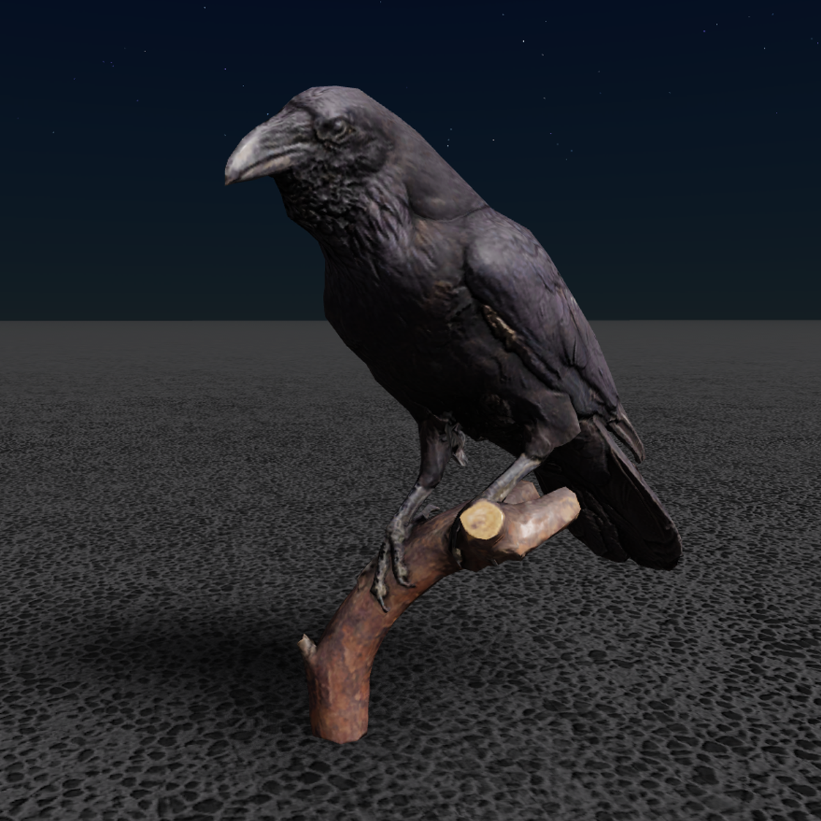
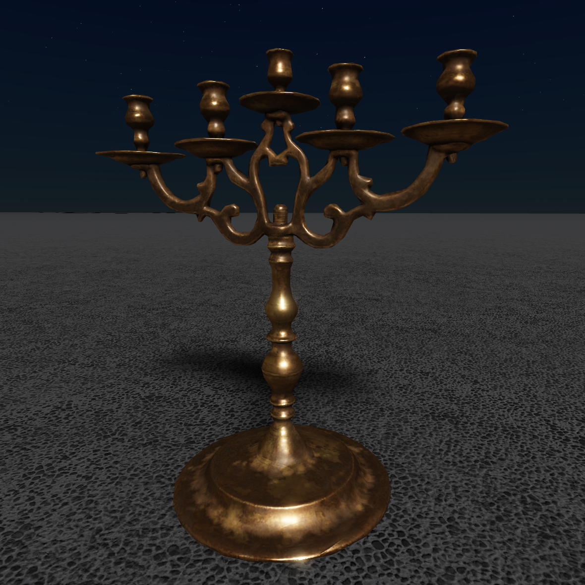
The backstory we created for the family describes them as "eccentric collectors'' dabbling in the occult. They've gathered artifacts from all over the world, and we wanted the house filled with things to reflect that story. We were able to source the scan data from CC0 museum content for models like antiques, statues, and taxidermy, then begin the UV mapping, retopologizing, and texture work required to optimize them for Studio.


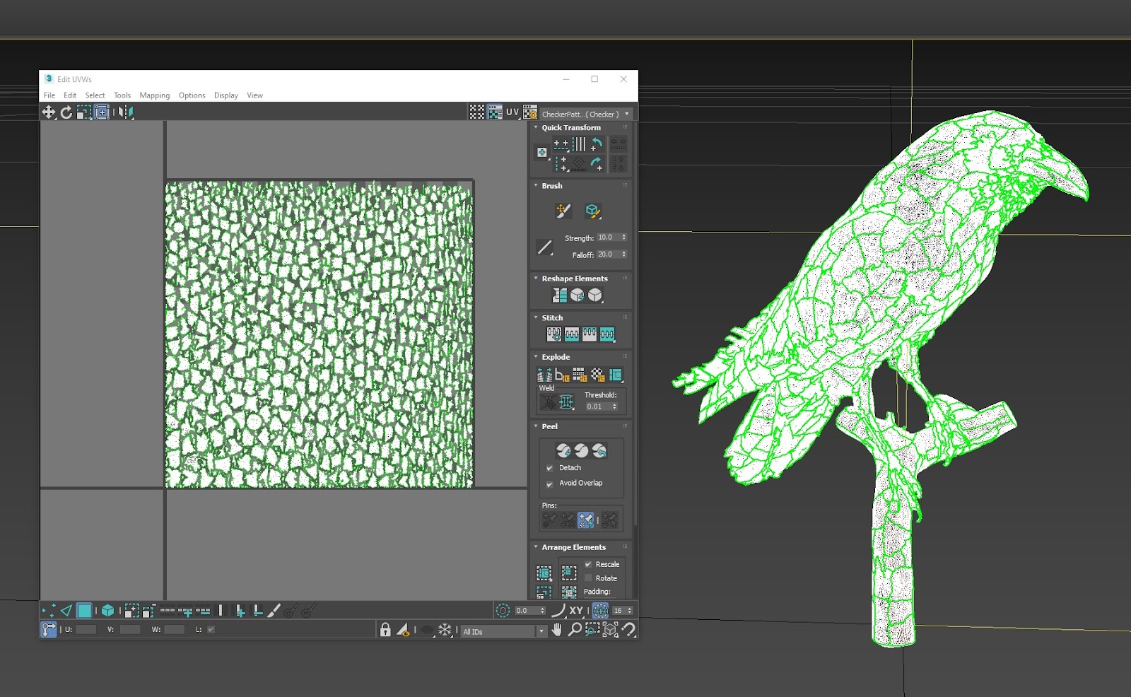
UV mapping is the 3D modeling process of unwrapping a 3D model's mesh and projecting a 2D image onto it. "U" and "V" represent the axes of the 2D texture because "X", "Y", and "Z" represent the axes of the 3D model. UVs tend to be automated at the time of the scan, and they tend to be poorly done for the purposes of game development. For example, the UVs for certain photogrammetry models can look like a bunch of individual planes, but this isn't the most performant for a mobile experience when creators are limited to 10,000 vertices. Sometimes we would get lucky with the scan data, but most of the time we needed to either update or completely redo these two-dimensional texture coordinates for the purposes of the experience.
In addition, most meshes from the models would only include the Diffuse texture with lighting information baked into the texture when the model was initially scanned. While this could be helpful to use as a base for the mesh's Albedo texture, it'd still require manual cleanup where we needed to paint out the light and shadow. If a mesh had strong directional lighting, it might look odd where the world lighting doesn't match. For this reason, we had to recreate most PBR textures for the models we used from the CC0 museum content.
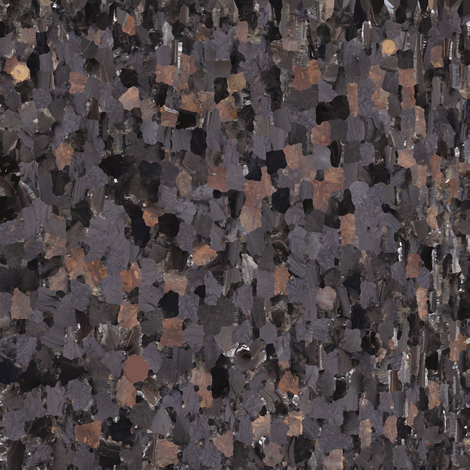
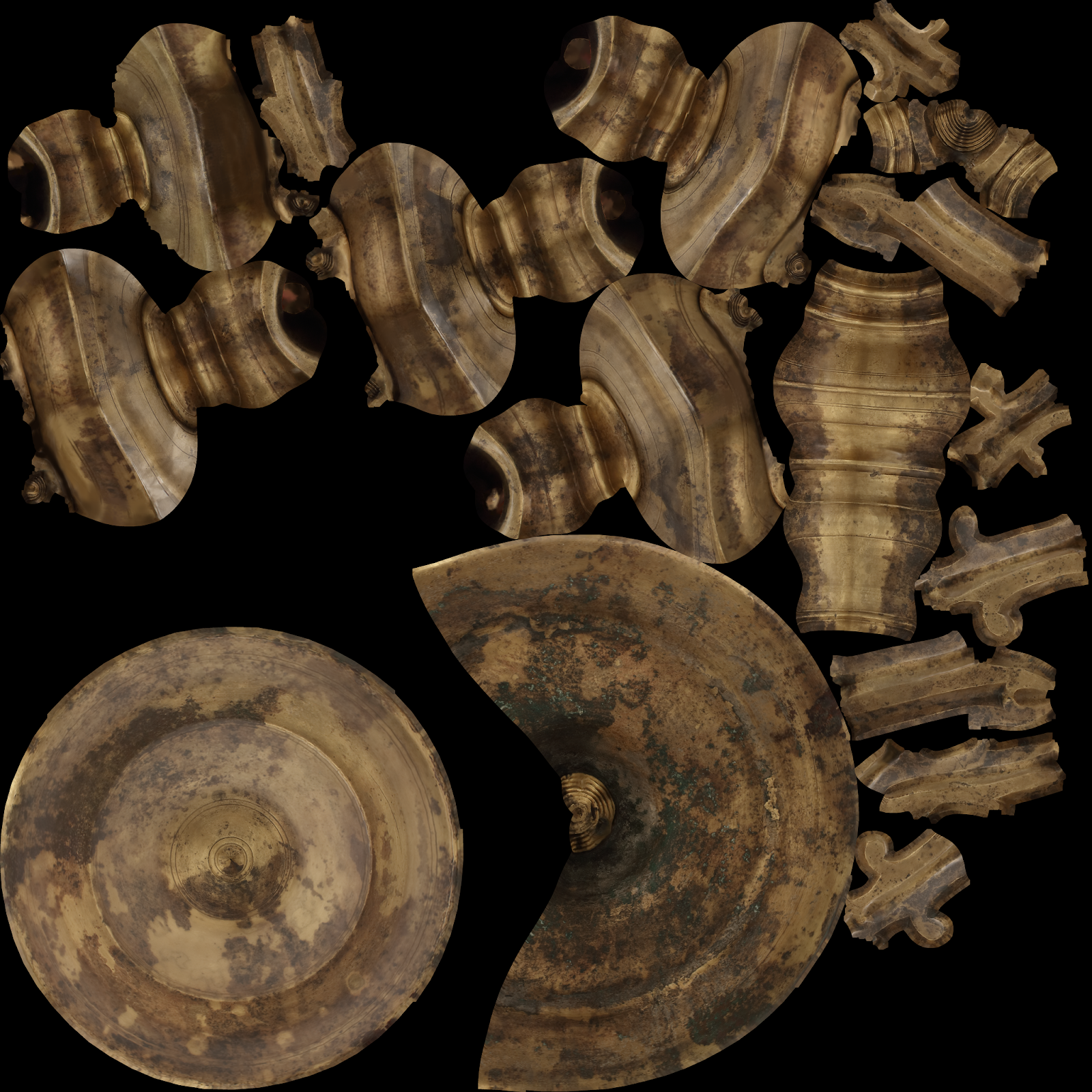
Physically-based rendering (PBR) is the notion of using realistic shading and lighting by more accurately simulating and representing materials and lighting in the real world. It was important to us when creating PBR textures to either not have any or very little lighting information baked into the Albedo texture because Studio's engine calculates this from the Image-based Lighting (IBL), in addition to using the texture's Normal, Roughness, and Metalness surface values to correctly represent real world materials. In comparison, a Diffuse texture may have either some or all of the detail from these individual maps baked into one texture, which is helpful when you may need the Diffuse texture to carry that detail on its own without the help of IBL or other individual PBR textures. When you're deciding whether to keep a Diffuse texture or create your own PBR textures, consider your own design or memory budget limits to what makes sense for your own experience.
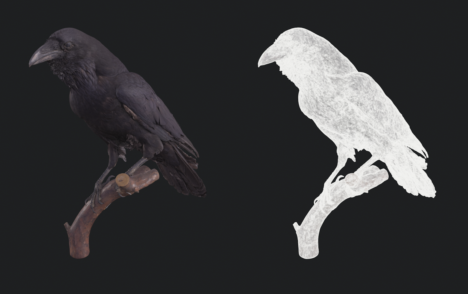
The meshes of the scan data that we used were usually fairly good, but some meshes needed to be cleaned up. For example, some meshes had problematic holes that needed to be filled, jagged edges that needed to be smoothed out, or thin edges that needed to be thickened up. For this process, we used Zbrush to edit the scan data.
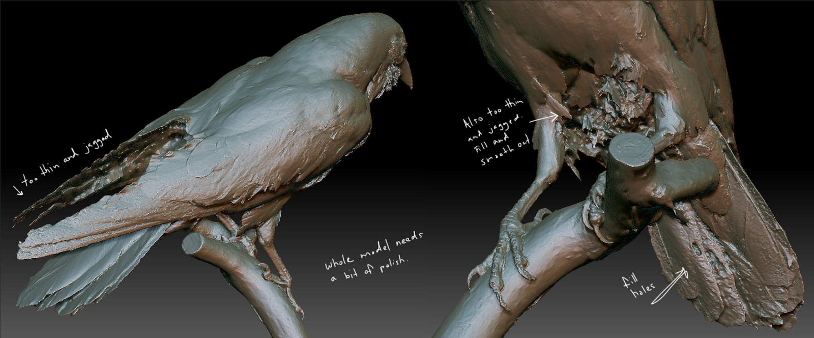
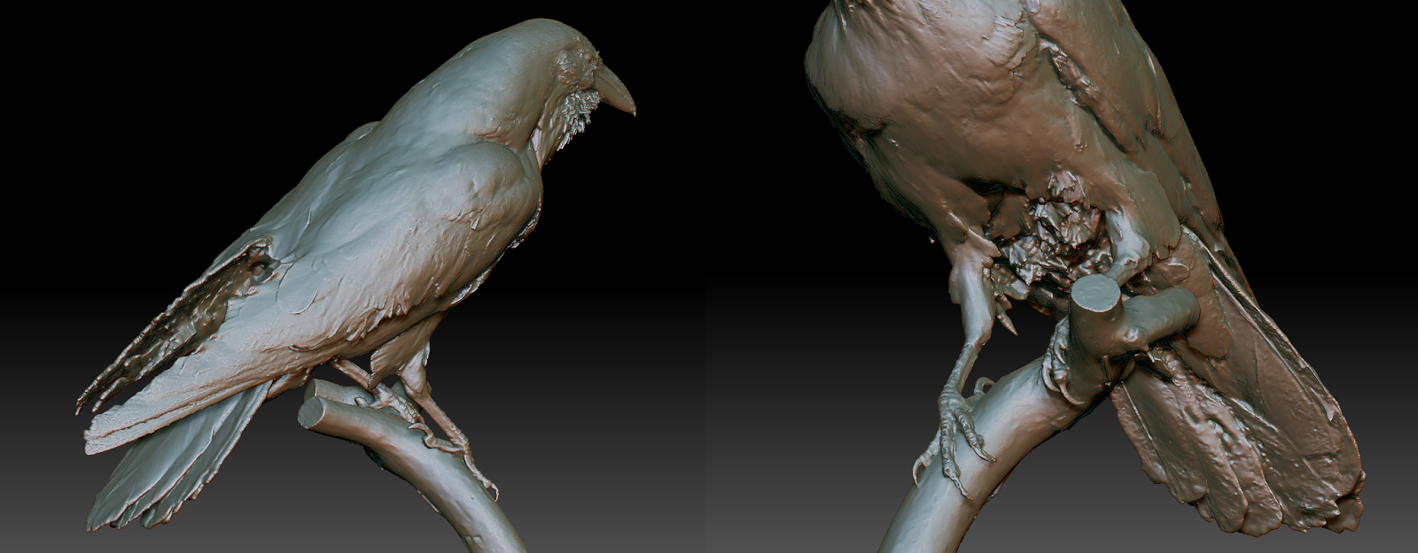
This process was by no means perfect, but by clearing up the high-resolution model, it was significantly easier to either automatically or manually retopologize the model's mesh. Retopologizing is the process of modifying a 3D model's edge distribution and structure, and for our purposes, retopologizing allows for a better texture bake when creating a lower resolution version of a high-resolution model. Lower resolution models are significantly easier on performance, especially on mobile devices, and it still keeps the high-resolution detail from the mesh and textures.
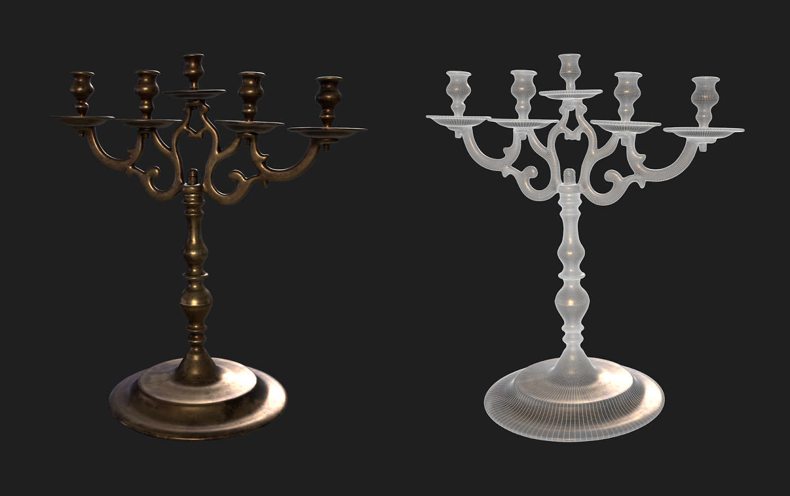
For manually or automatically retopologizing, you can use any 3D application of your choice. We chose to use 3DS Max to manually retopologize, and Zbrush to automatically retopologize using the Zremesher or Decimation Tool. The Zremesher tool allowed us to auto-retopologize a mesh to maintain quads which requires a higher vert count to maintain the shape, while the Decimation tool allowed us to auto-retopologize using triangles with a lower vert count and was still able to maintain the shape.
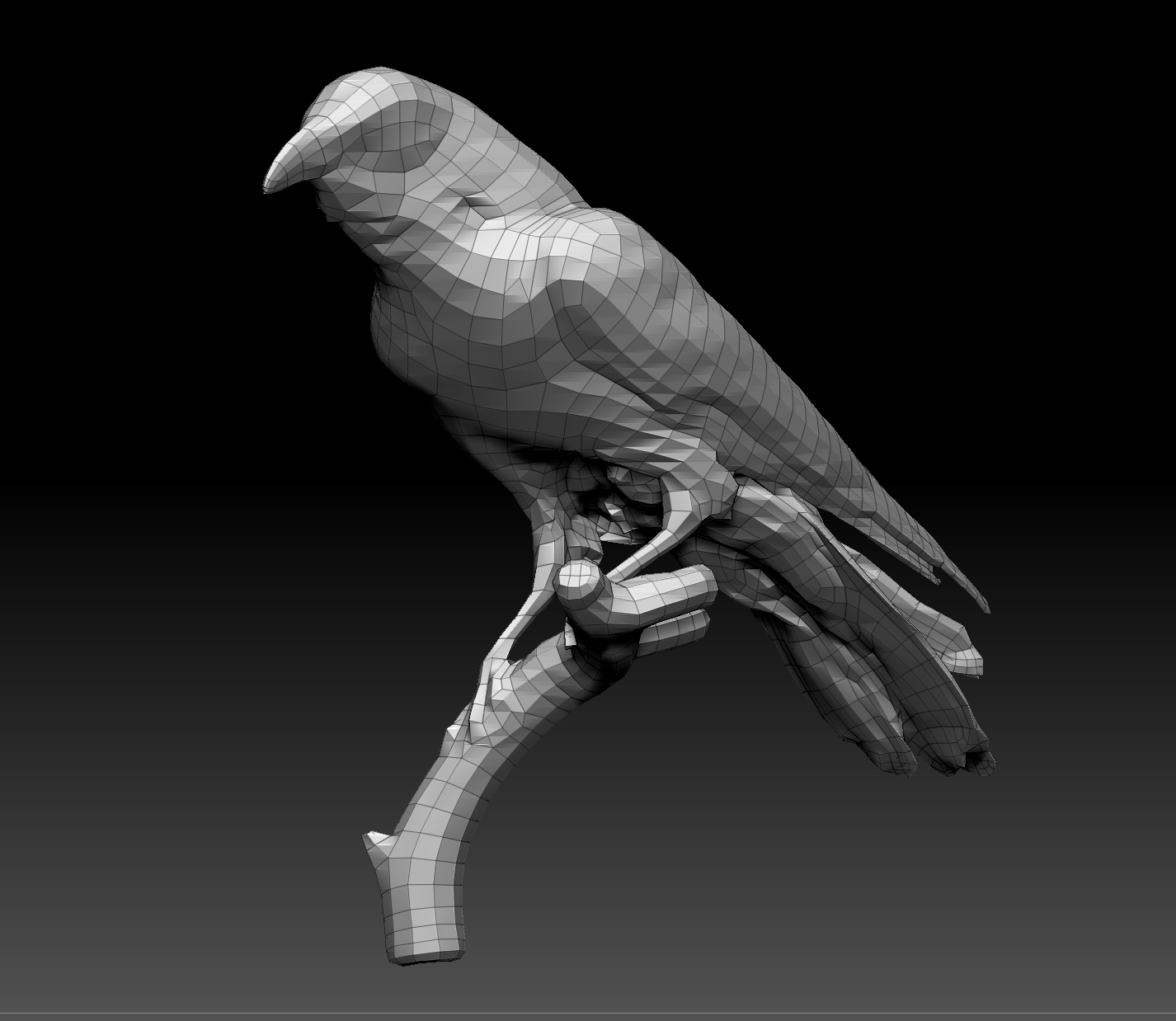
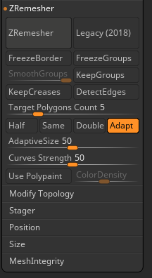
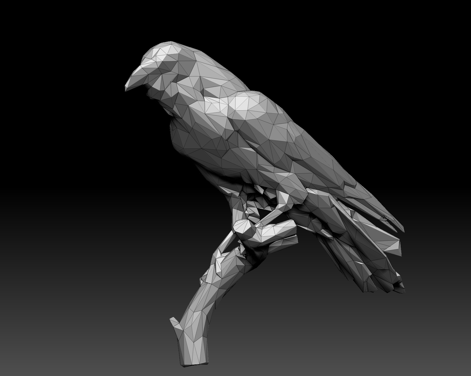
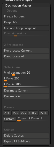
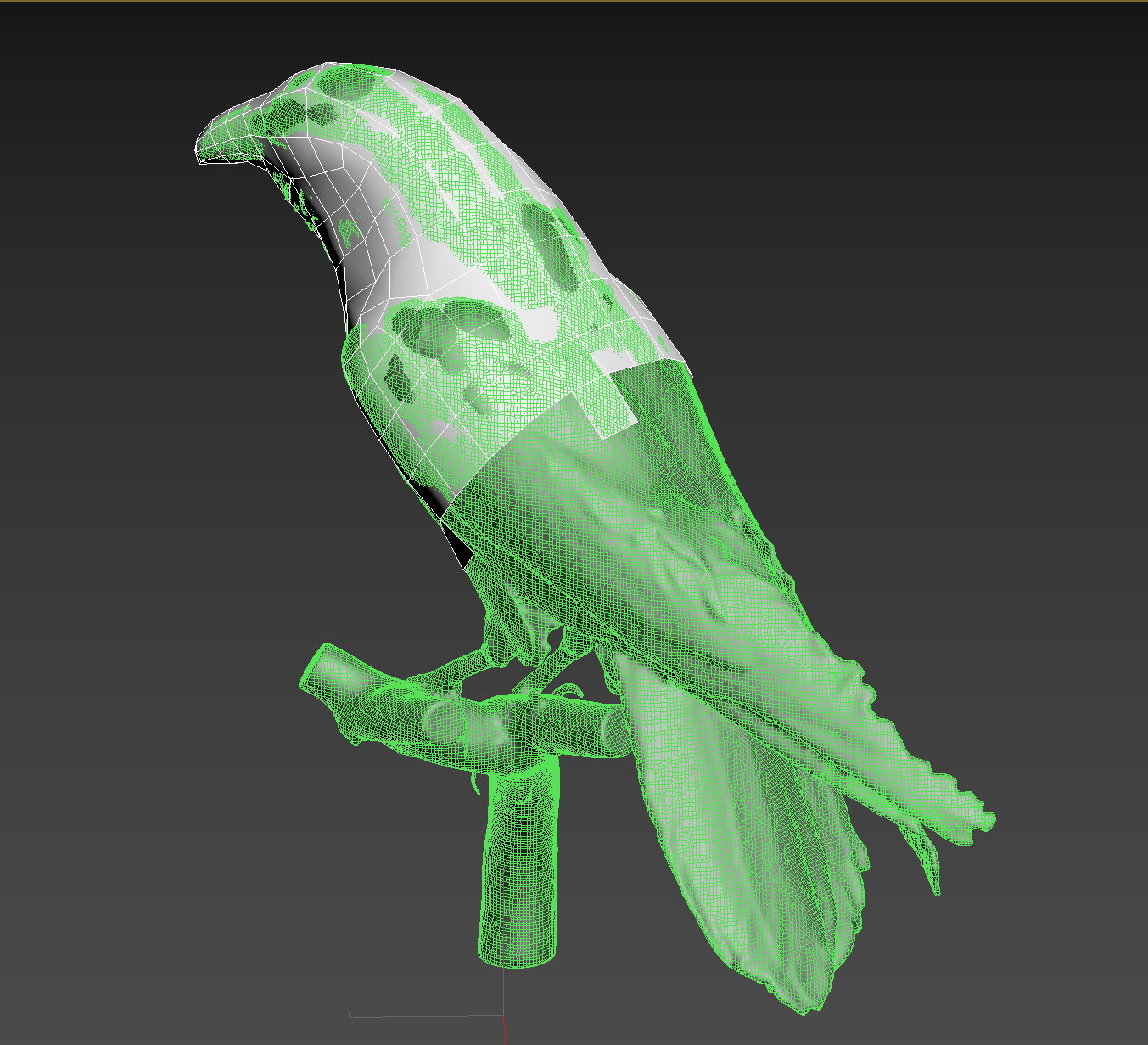
Regardless of the automatic route we could choose for our models/meshes, we likely needed to do some cleanup since the auto-retopologizing greatly relies on the high-resolution mesh, how it was constructed, and its algorithm. We tended to choose the decimation route with a triangulated mesh because it was more important to us to have a lower vertex count while maintaining the original shape.


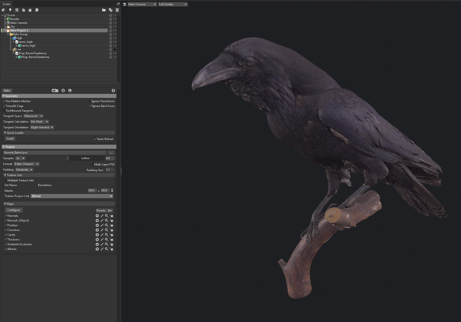
After we completed the process of retopologizing the mesh with new UVs, we needed to then bake and transfer the high-resolution mesh detail and textures. Marmoset made it easy to do this process when baking mesh maps and transferring any original textures from the high-resolution model to low-resolution, but you may find other workflows and methods in other 3D applications that work better for you. Regardless of the tool, ensure any original textures on the high-res model is assigned to the model when baking.


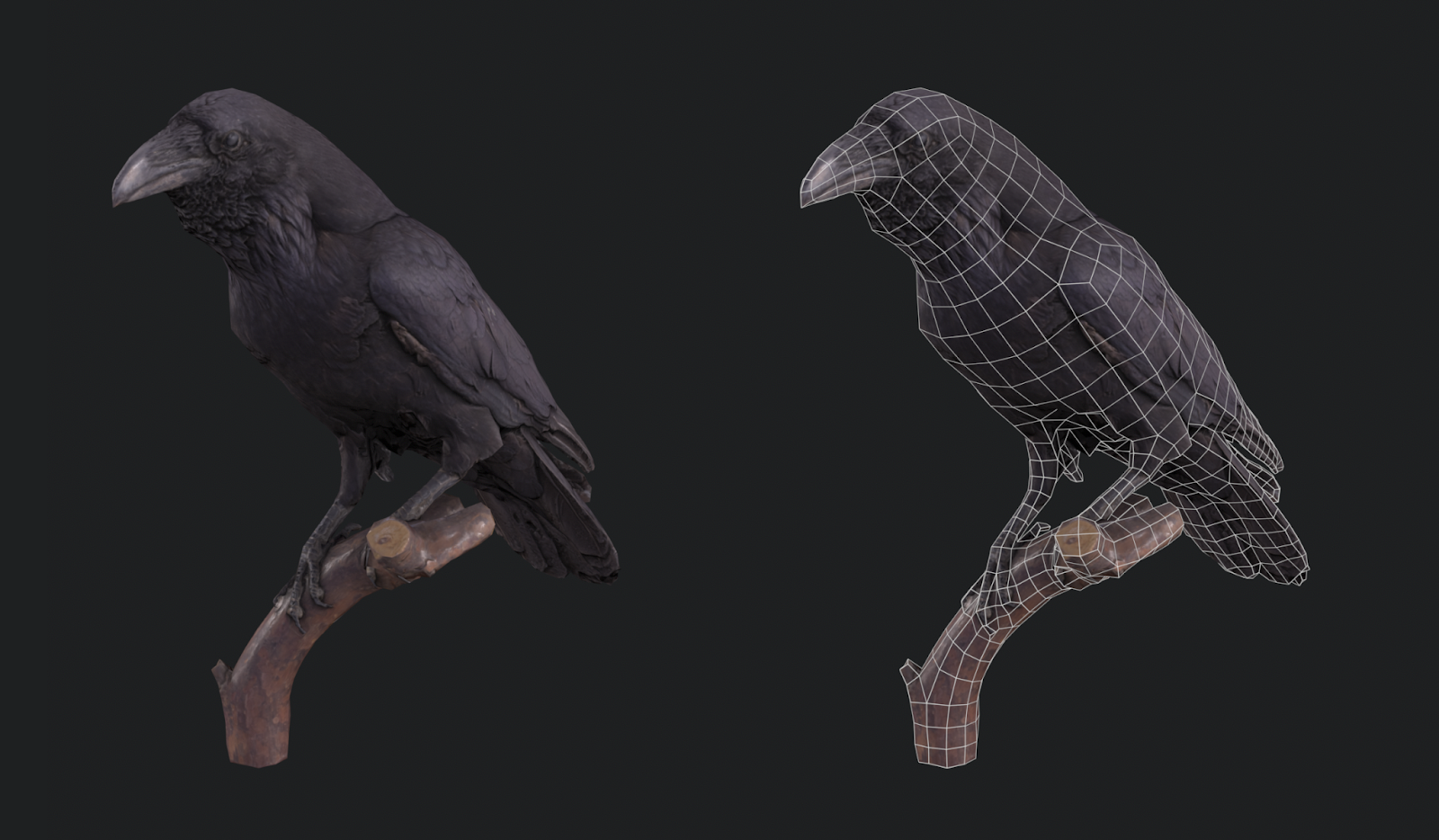
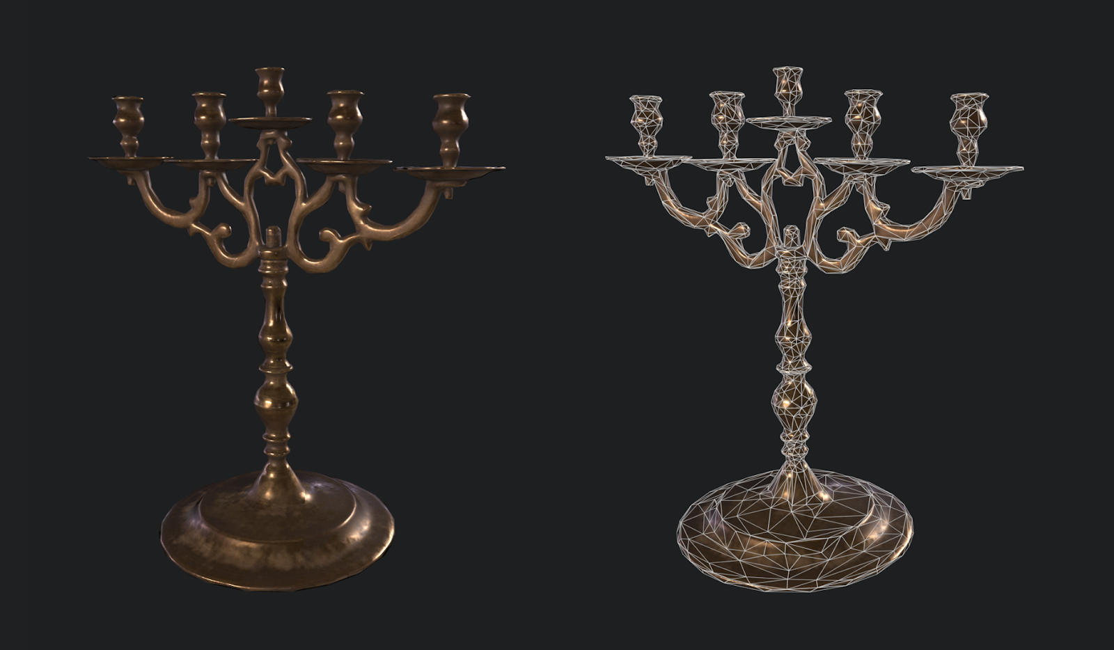
After we finalized our Albedo, Normal, Metalness, and Roughness PBR textures in Substance Painter, our new assets were ready to be imported into Studio! There were some quality differences between the scan data assets vs. the retopologized assets, but it was ultimately a worthy trade-off when the asset was only 1,000 vertices instead of 1,000,00. It also kept our memory budget intact and allowed the experience to run more smoothly.
Utilize packages
Packages are a system that allows you to store and use a version of either a single object or a group of objects, and when you update that version, it updates all instances of that object or group at once. For example, if you make a tree object and place hundreds of that object within your experience, you only need to update the package in order for the hundreds of trees to update to your new version at once. We knew early on we would have two states of most rooms in the house, their normal state and their corrupted state, and we needed to maintain both copies of the house and their contents throughout the entire iteration process. For this reason, we decided on what objects needed to be shared in each house state and converted them into packages.
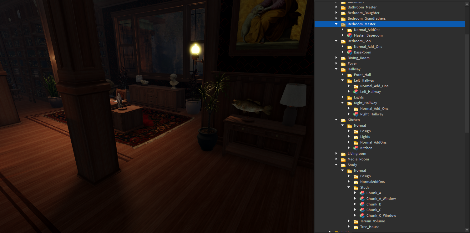
Packages allowed us to modify everything from the wood trim on wall panels to entire rooms, then both states of the room would update to our changes. We were also able to convert SurfaceAppearance objects to packages so we could update a material's appearance everywhere throughout the experience at once. Reusing materials was instrumental to make the demo as performant as possible for devices despite its clear complexity.
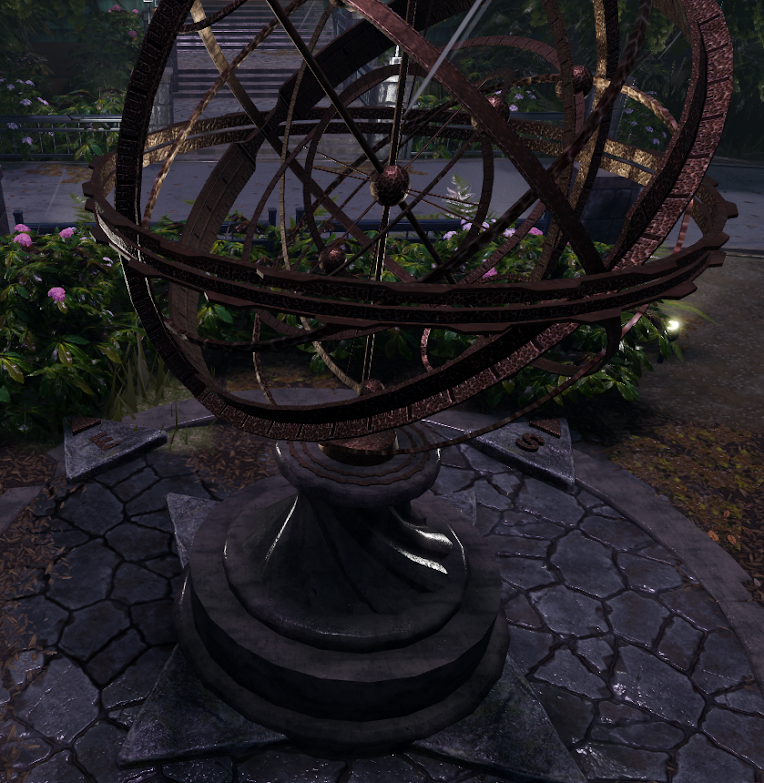
For example, the following images display an armillary model package with a complex group of child assets, including a metal surface appearance package that we use in several places within the demo. Wherever we updated the metal surface appearance package, we could also perform a mass update that would force the armillary model package to update the child surface appearance package too.
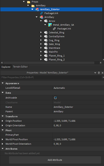
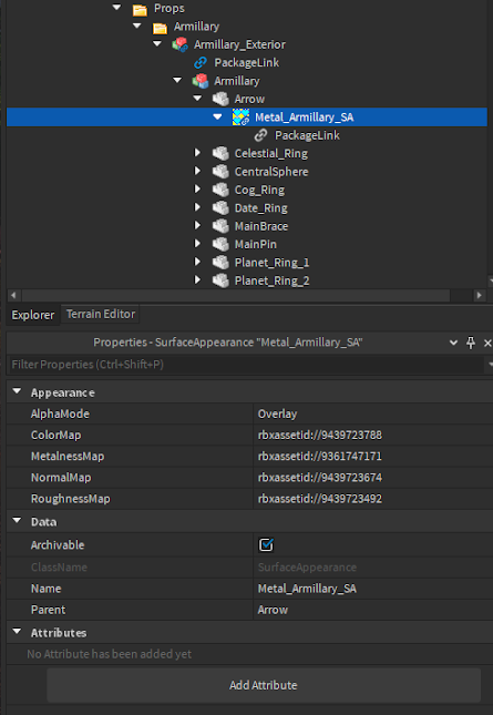
For more information on how to turn an individual object or a group of objects like Models or Folders into a package, or for how to choose a creator of the package for edit access, see Packages. We chose to designate the Vistech Demo Group as the creator of all of our packages because it let everyone in our group access and edit the packages whenever they needed to. It also allowed us to share these packages between every experience the group owned!
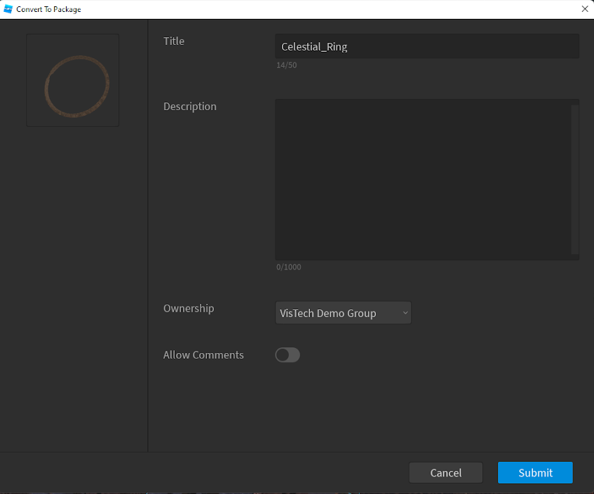
We set parent packages, such as the armillary above or an entire room, to automatically update so that the changes to the model or folder automatically shared across all instances of that package without us having to manually check. This process meant we could smoothly create changes for each room's normal and corrupt states. For example, the following two images show the study's normal and corrupt state that were created through the same package. Only a few items outside of their packages differ between them, even considering that the corrupt state is sideways!
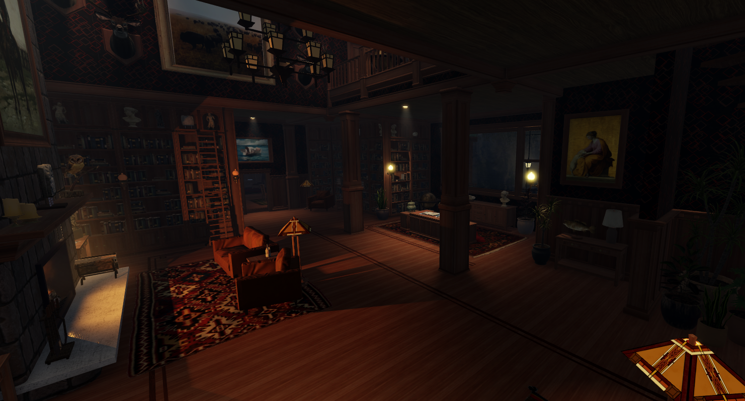
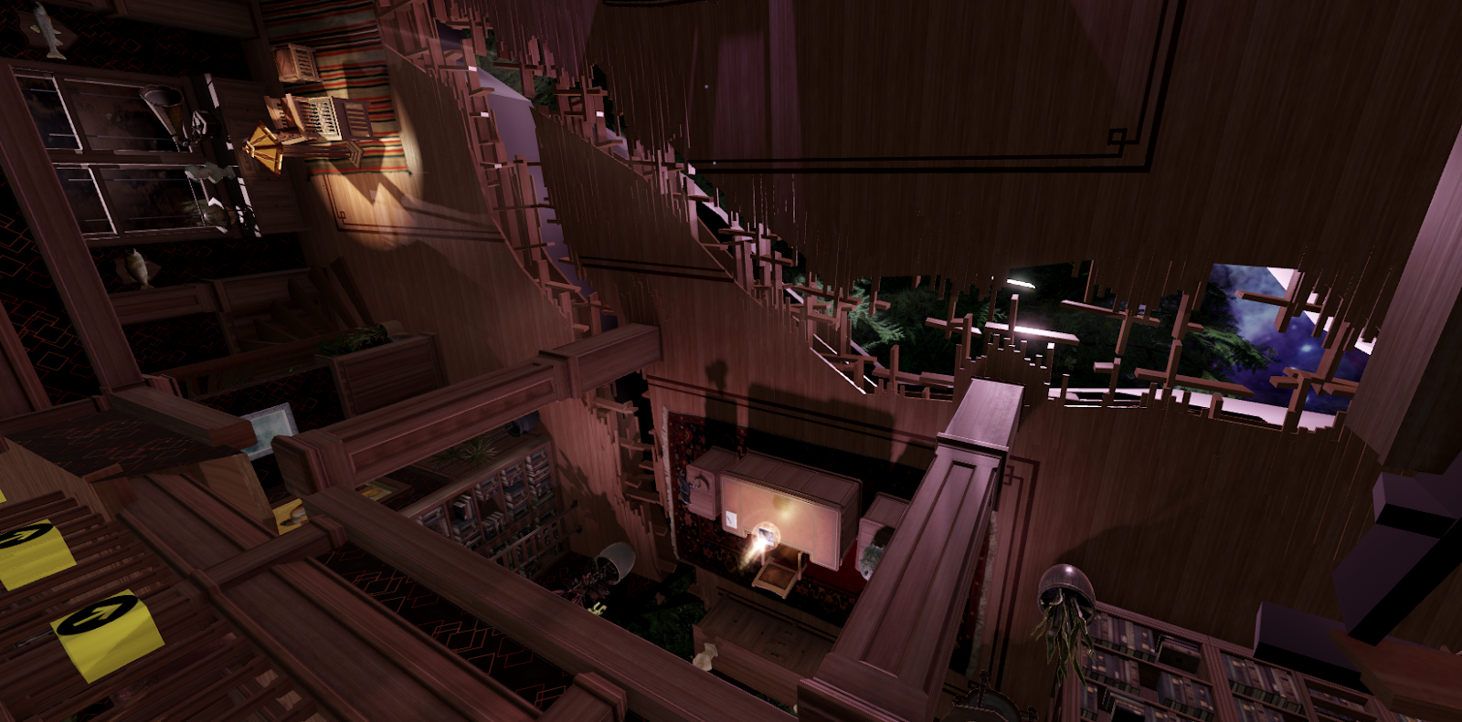
Instead of working entirely in the same place file as the experience, we built an asset storage place with all our components with package links. Whenever we made a change to a package in this storage place, it would update automatically and immediately across every place that uses that package. We could modify objects, add functions, and work on details without having to navigate the main experience's mood and lighting that could make it hard to see what we were doing.
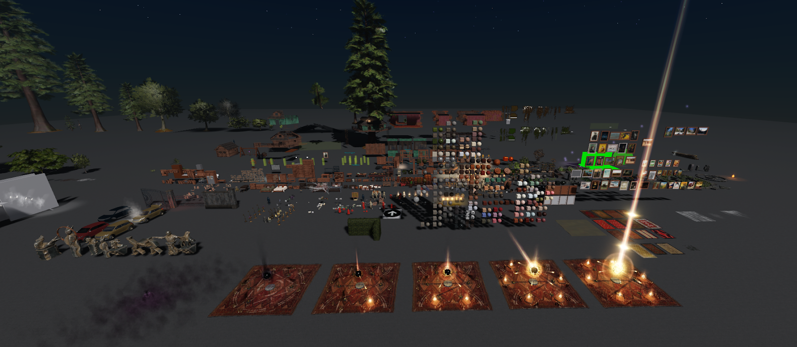
Packages allowed us more freedom to explore different ideas in 3D without having to do a lot of extra work. We could plan, test, or even revert to any previous version of an asset if an experiment didn't pan out in practice or broke the experience. There were many times where hours worth of work were restored by going back a version in the packages. In the end, we couldn't have achieved the final level of polish in this demo without packages.
