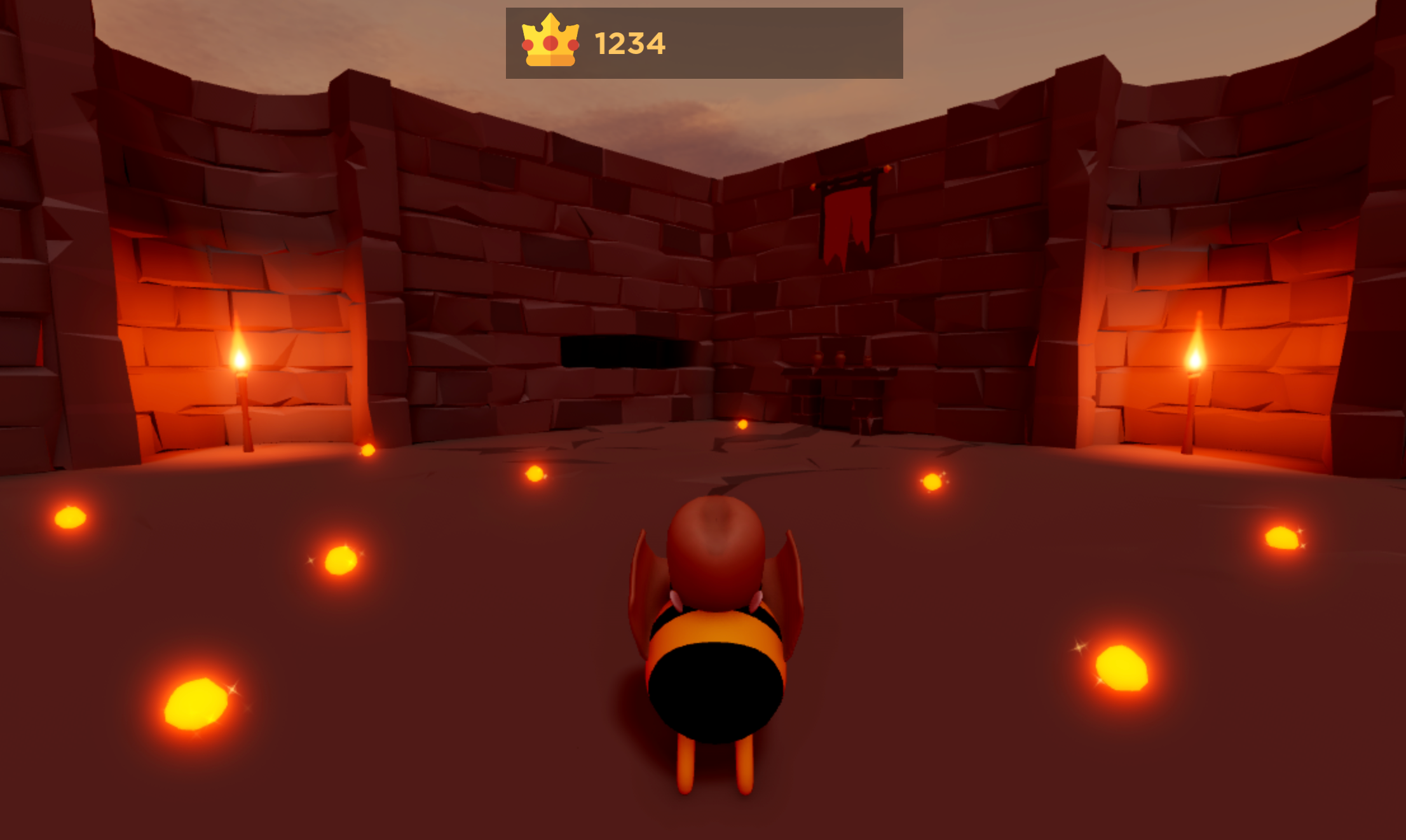
A score bar is a UI element that displays player information that is important for your experience's gameplay, such as their leveling up statistics, currency count, or power-up items in their inventory. By displaying score bars directly on the player's screen, you can keep their attention on what they need in order to accomplish various goals within your experience.
Using the Gold Rush .rbxl file as a reference, this tutorial shows you how to create a score bar that tracks the amount of gold players collect, including guidance on:
- Creating a frame in the top-center of the screen.
- Adding a crown icon that communicates what the score bar is tracking without any textual guidance.
- Inserting score text that records the amount of gold the player collects.
- Testing your UI design on multiple emulated devices to review its appearance on different screens and aspect ratios.

Create the frame
To display UI elements on every player's screen, you can create a ScreenGui object in the StarterGui service. ScreenGui objects are the primary containers for on-screen UI, and the StarterGui service copies its contents to each player's PlayerGui container as they enter an experience.
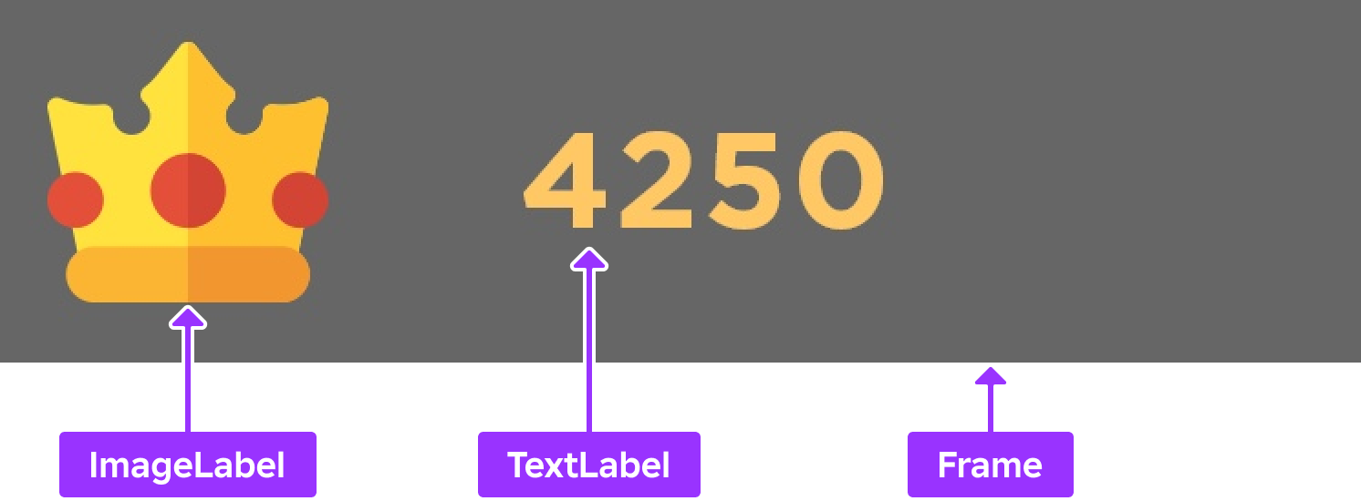
After you create a ScreenGui object, you can create and customize its child GuiObjects according to each container's purpose. To demonstrate this concept, this section teaches you how to create a ScreenGui object with a child Frame object that will contain both the icon and text of the score bar.

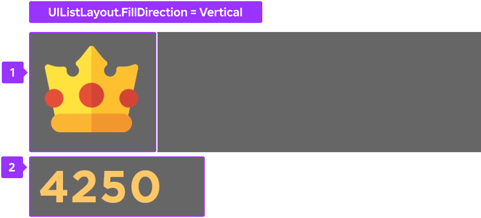
In addition to customizing the frame's properties, this section also provides instructions on adding a child UISizeConstraint and UIListLayout object to the frame. This technique ensures that GuiObjects automatically arrange horizontally as you insert them into the frame, and that they are always legible on smaller screen sizes. If you don't follow this guidance, every GuiObject you add to the frame will arrange outside of the frame's perimeter.


To recreate the frame container within the sample Gold Rush place file:
Create a ScreenGui object to contain your on-screen UI.
- In the Explorer window, hover over StarterGui and click the ⊕ icon. A contextual menu displays.
- Insert a ScreenGui.
Create a container for the entire score bar UI component.
Insert a Frame into the ScreenGui object.

Select the new Frame, then in the Properties window,
- Set AnchorPoint to 0.5, 0 to set the frame's origin point in the top-middle of itself (50% from the left to the right of the frame, and 0% from the top to the bottom of the frame).
- Set BackgroundColor to 0.6 to make the frame's background black.
- Set BackgroundTransparency to 0.6 to make the frame's background semi-transparent.
- Set Position to {0.5, 0},{0.01, 0} to set the frame near the top-middle of the screen (50% from the left to the right of the screen, and 1% from the top to the bottom of the screen).
- Set Size to {0.25, 0},{0.08, 0} so the frame takes up a large portion of the middle of the screen to grab the player's attention (25% horizontally, and 8% vertically).
- Set Name to ScoreBarFrame.

Add a constraint to the frame so that its contents are always legible on small screen sizes.
- Insert a UISizeConstraint object into ScoreBarFrame.
- Select the new constraint, then in the Properties window, set MinSize to 0, 40 to ensure the frame never shrinks to less than 40 pixels vertically.
Add a layout object to the frame so that its contents arrange from left-to-right and vertically center within the frame's perimeter.
- Insert a UIListLayout object into ScoreBarFrame.
- Select the new layout object, then in the Properties window,
- Set FillDirection to Horizontal.
- Set VerticalAlignment to Center.
Add an icon
An icon is a symbol that represents an action, object, or concept in an experience. Using icons that are simple and intuitive allows players to easily recognize what you're communicating with your UI without using text, which can clutter the screen and pull attention away from content that matters.
For example, the sample uses a simple gold crown icon to indicate how much gold a player has collected. This icon is easily recognizable as being the most important goal within the experience, and it includes minimal details so that it remains legible on mobile device screens.
To recreate the gold crown icon within the sample Gold Rush place file:
Insert an ImageLabel object into ScoreBarFrame.
In the Explorer window, hover over ScoreBarFrame and click the ⊕ icon. A contextual menu displays.
Insert an ImageLabel.

Select the new label, then in the Properties window,
Set Image to rbxassetid://5673786644 to make the icon a crown.
Set BackgroundTransparency to 1 to make the label's background completely transparent.
Set LayoutOrder to 1. This ensures the icon remains the first GuiObject in the frame from left-to-right when you insert text in the next section of the tutorial.
Set Size to {1.25,0},{1,0} to widen the label area beyond the full width of the frame.
Set SizeConstraint to RelativeYY to preserve the icon's aspect ratio by scaling the size of the label with the height of the parent frame.

Insert score text
Score text records the player's score within an experience, such as how many points they earn within a match. It's important that all UI text is both clear and easy to read so players can quickly understand the information they need to be successful within your experience.
For example, the sample uses large text on top of a contrasting color so that it doesn't blend in with the noise of the background. This is particularly significant for accessibility because it ensures the text remains legible as the player moves through the 3D space, which may include objects that are the same color as the text.
To recreate the score text within the sample Gold Rush place file:
Insert a TextLabel object into ScoreBarFrame.
In the Explorer window, hover over ScoreBarFrame and click the ⊕ icon. A contextual menu displays.
Insert a TextLabel.

Select the new label, then in the Properties window,
Set BackgroundTransparency to 1 to make the label's background completely transparent.
Set Size to {1,0},{1,0} to widen the label to the whole frame (100% horizontally and 100% vertically of the parent frame). The label extends beyond the frame's boundaries because it's being offset by the icon.
Set SizeConstraint to RelativeYY to ensure the size of the label scales with the height of the parent frame, and preserve the icon's aspect ratio. This step also makes the label a square and keeps it within the frame's boundaries.
Set Font to GothamSSm to match the aesthetics of the environment.
Set Text to 0 to start the score from zero.
Set TextColor3 to 255, 200, 100 to tint the text gold.
Set TextSize to 30 to make the text bigger on the screen.
Set TextXAlignment to Left to ensure the score text remains left-aligned near the crown icon regardless of whether the player's score is 0, 1,000, or 1,000,000.

Test the design
Studio's Device Emulator allows you to test how players will see and interact with your UI on various devices. This tool is a vital part of designing UI because the aspect ratio of your viewport in Studio doesn't necessarily reflect the aspect ratio of the screens players use to access your experience, and it's important that your UI is both legible and accessible on every device.
For example, if you don't test your UI on a range of screen sizes, players with large screens may not be able to read your text or decipher your icons, and players with small screens may not be able to see the 3D space because your UI elements take up too much room on the display.
To emulate your UI on various screen sizes:
In the toolbar, select the Test tab.
Click Device. The viewport changes to reflect the aspect ratio of an average laptop.

In the resolution dropdown, select Actual Resolution. This allows you to see the true resolution of your UI elements on the device you're emulating.

In the device dropdown, select at least one device within the Phone, Tablet, Desktop, and Console sections.
