Choosing an art style is the process of planning an aesthetic direction for your UI elements. It's important to begin your design process with an art style because art styles provide visual ground rules you can reference to ensure your UI intuitively provides players information about what they can do in your experience.
Using the sample laser tag experience .rbxl file as a reference, this section of the user interface curriculum shows you how to make meaningful decisions on how to design your UI elements according to the genre of your experience, including guidance on:
- Identifying necessary UI elements according to what you want to communicate to players throughout your experience.
- Selecting a color theme that reinforces genre-specific color conventions that are intuitive for your audience.
- Outlining simple icons that are easy to decipher on any screen size.
- Establishing a button order that matches the likelihood of different player workflows.
- Determining a text system that ensures legibility on target devices.
After you complete this section, you will learn how to design the structure and flow of the information you want to communicate to players through UI within your experience.

Identify your UI elements
The first step in choosing an art style for your UI is to identify what UI elements you need for the varying types of information you want to communicate to your audience. Doing this work at the start of your design process is crucial because it allows you to categorize UI elements by their functional purpose, make semantic decisions according to where and when players are going to interact with each UI element, and plan where you can reuse UI elements across your experience.
There are many different ways to brainstorm which UI elements are necessary for your gameplay requirements, but it's recommended to start with envisioning what a player needs to know as soon as they join your experience. For example, when a player opens the sample laser tag experience, they may ask themselves the following questions:
- What is the goal of the experience?
- How do I know who is on my team?
- How do I keep track of my team's points?
- How do I select a blaster?
- How do I know where the blaster shoots a laser?
- If I'm on a mobile device, how do I shoot my blaster?
- After I shoot a laser, when can I shoot again?
- How do I know when I am starting the round?
- How do I know when I successfully tag someone with my blaster?
- How do I know when the enemy team successfully tags me?
By using these questions to understand what information is imperative for players to know to be successful, you can sort the sample laser tag experience's UI needs into three categories:
- Information about the experience's objective.
- Information about the blaster.
- Information about the state of the player.
Sorting your experience's UI needs into categories is helpful because you can formulate your art style around each grouping to reinforce what information each category needs to teach players. For example, if you want your UI to tell players what actions they can take regarding their character's health status, you might choose an art style with UI elements that prioritize the color green and/or plus icons so players can quickly recognize their function.
After you sort your experience's UI needs into categories, you can create a list of the UI elements necessary to meet the requirements of each category. To demonstrate, the sample laser tag experience uses the following table of UI elements to address the previous list of potential player questions. As you work through this tutorial, the UI curriculum will continue to refer to this list and highlight major design decisions that relate to each category of UI elements.
| Category | UI Elements |
|---|---|
| Information about the experience's objective |
|
| Information about the blaster |
|
| Information about the state of the player |
|
Now that you have a list of UI elements for your experience, it's time to begin making stylistic and semantic choices for each grouping of UI elements, starting with a color theme.
Select a color theme
A color theme, or color palette, is a selection of colors that each communicate a message through consistent application within your experience, such as using a bright color to indicate when something is selectable. Applying a color theme to your UI elements is important, especially when you rely on color conventions within the genre of your experience, because it allows players to quickly understand your UI with minimal effort.
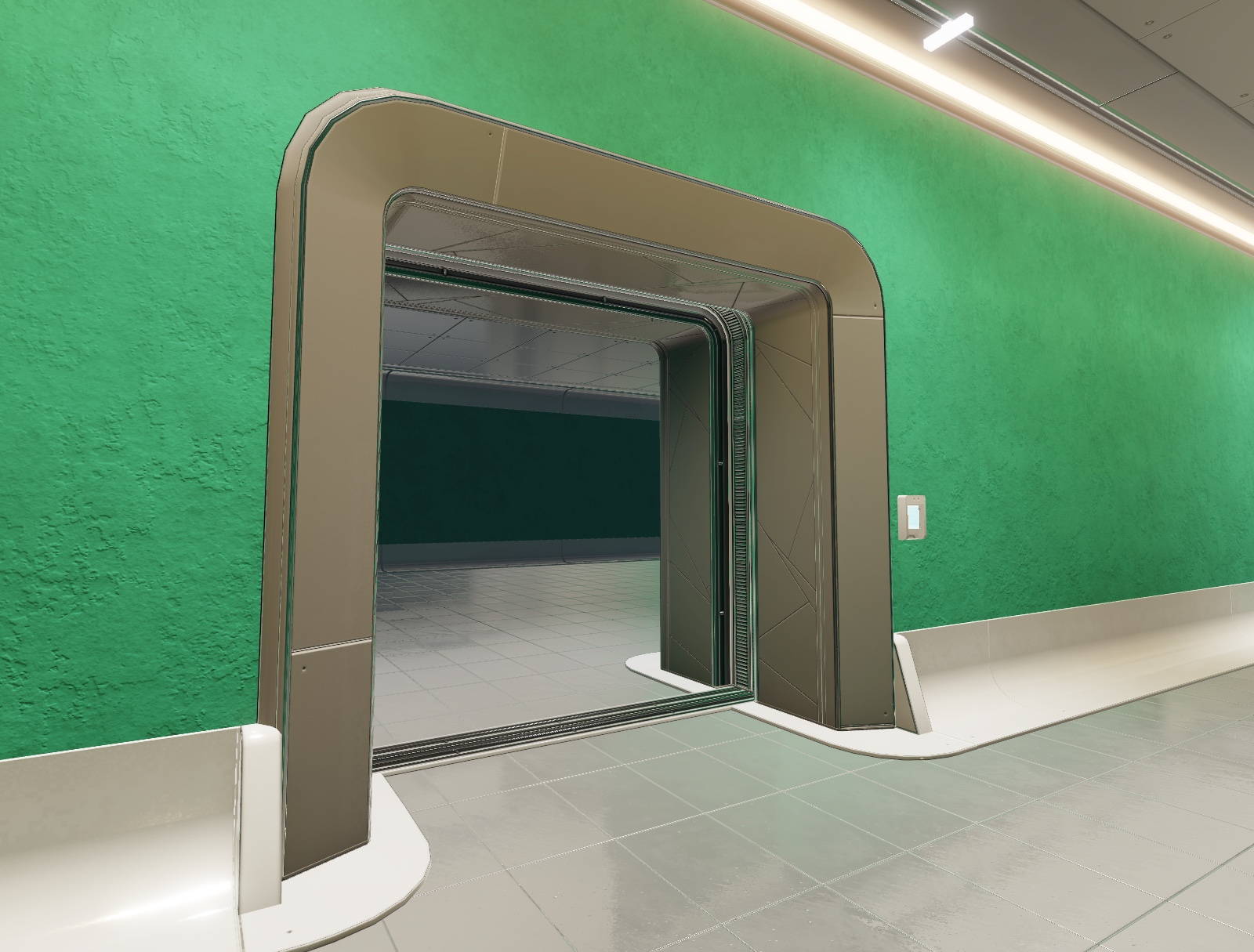
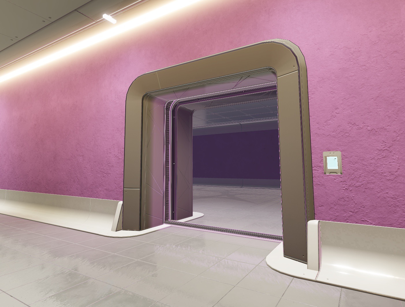
In the Environmental Art Curriculum, each half of the laser tag environment is color-coded from a top-down view to differentiate which area of the map is near each team's respective spawn zone: mint for the team that assembles on the left side of the map, and carnation pink for the team that assembles on the right side of the map. These specific colors are useful because they are complementary, meaning that they contrast each other well, and enable players to easily scan their surroundings and orient themselves regardless of what direction they're facing in the building.


The sample laser tag experience uses this same color theme in its UI to highlight information that pertains to each team, such as each player's team indicator within the 3D space, or the team point tracker that overlays the screen. This consistency assists players in being able to quickly understand information about the experience's objective during the fast-paced gameplay of a first-person shooter experience, especially as players need to make rapid decisions while traversing the environment.

When selecting a color theme for your own experience, consider the following:
- The strength of a color theme relies on helping players make quick mental associations between each color and their function. For this reason, limit your color theme to only highlight the key information you want players to associate with your UI elements.
- To ensure players with colorblindness can understand the message of your color theme, don't always rely on color alone to distinguish between UI elements. Instead, combine colors with icons, shapes, and/or animations to ensure your UI communicates effectively with every player.
- It's more important for your UI to be legible than aesthetically pleasing. For this reason, prioritize simple UI with color that remains readable over both light and dark elements in the 3D world.
To highlight the guidance in the last point, the sample laser tag experience utilizes the neutral colors of black and white for almost every other UI element that overlays the 2D screen. Black and white contrast each other well, and they are easy to read as the rest of the screen displays an otherwise colorful 3D environment.

Outline simple icons
An icon is a symbol that represents an action, object, or concept in an experience. Outlining icons that are simple and intuitive is important because the end result enables players to easily recognize what they are able to do and what you want to tell them through your UI without using text, which can clutter the screen and pull attention away from content that matters. This process is even more crucial if your audience accesses your experience using a small screen on mobile devices.
Simple icons ideally have a distinct style from your 3D elements while still complimenting the overall world of your experience. For example, in the final environment of the Environmental Art Curriculum, both modular and prop 3D assets have a clean, high-tech art style that utilizes rectangular forms with soft, rounded corners. From the beveled panels along the floor to the near circular windows in the ceiling, nothing includes a sharp edge.


To complement this art style while still remaining unique, all UI elements that you will learn to make later in this tutorial include a futuristic aesthetic and round angles without matching the shape language of the 3D assets in the environment. This keeps each icon's meaning distinct from other information in both the 2D and 3D space.
To demonstrate this concept, see the following two images from the sample laser tag experience of the crosshair that tells players where their blaster shoots on the screen, and the button that allows players to shoot their blaster on mobile devices. Both icons include soft angles to be cohesive with the overall world, but their hexagonal and circular shapes set them apart from anything a player could associate the icons with in the experience.


When outlining simple icons for your own experience, consider the following:
- Simple icons are legible even when they are small. For this reason, limit details on your icons that would become unrecognizable on mobile device screens.
- Icons are powerful because they can communicate a message no matter the player's language. As long as it doesn't impact player comprehension of your UI, replace unnecessary text with icons to improve localization efforts.
- Many experiences of the same genre use icons that are stylistically similar, such as a sword icon that represents strength, or a beaker that represents magic. Embrace the symbolism within your experience's genre so players can understand your icons without additional guidance.
If you don't know what types of icons are common within your experience's genre, check out the Game UI Database. This free resource tool for UI designers includes screenshots from hundreds of games of different genres that you can reference during your design process.
Establish an interaction order
An interaction order is the sequence of interactions players can have with your UI. As there are often multiple interactable UI elements on the screen, it's important to establish an intuitive interaction order to assist players in making decisions as they navigate various workflows.
There are typically three types of interactions in a workflow:
- Primary Interaction – The action a player is most likely to perform.
- Secondary Interaction – The action a player is likely to perform as an alternative to the primary action.
- Tertiary Interaction – The action a player is least likely to perform.
Each interaction type must have a different level of visual emphasis depending on the likelihood of a player performing the action. To illustrate this concept, examine the following image of the interaction order for the workflow to select a blaster in the sample laser tag experience, in which A represents the primary interaction, B represents the secondary interaction, and C represents the tertiary interaction.

In this workflow, the action a player is most likely to perform is to select between the two different types of blasters, so the blaster buttons are much larger than any other interactable element in the design. This level of visual emphasis grabs the player's attention, and draws their eye to the middle of the overall UI element. After the player makes their decision, the logical next step in the workflow is to confirm their selection and start the round. For this reason, the SELECT button is directly below the primary interaction.
While unlikely, the player may not know they are able to select one of the blaster buttons to communicate which blaster they want to use. To assist in this situation, there are two arrow tertiary buttons the player can utilize to cycle between their choices. These buttons are subtle and much smaller than the elements of the primary and secondary interactions, but they are also perceivable to the player that needs direction on what actions they are able to perform.
If you were to place these primary, secondary, and tertiary interactions in a different interaction order, such as swapping the SELECT button with the left arrow button, players wouldn't have clear direction on the sequence of choices they need to make. For this reason, in addition to the visual emphasis of a button order, effective workflows follow a visual hierarchy that guides players through your ideal order of decisions according to the direction they are likely to scan information, such as top-down and left-to-right.

When establishing an interaction order for the workflows in your own experience, consider the following:
- Players need to have a clear understanding of when they can interact with your UI to perform actions. For this reason, it's recommended to provide at least one form of visual feedback for interactable UI elements, such as displaying an outline or changing a button's size, color, or animation when it's in focus.
- If labels on interactable UI elements are vague or similar to one another in the same workflow, players can misunderstand how to complete an action or process. To avoid a negative player experience, create labels that are clear, concise, and distinct from one another.
- If interactive UI elements are too large, they can distract from other important information on the screen. Conversely, if they are too small, they can be hard to read or difficult to select, especially if they're in close proximity on mobile devices. For this reason, it's essential to review the size of your interactable UI elements on various screen sizes.
In Implement in Studio, you will learn how to use UIAspectRatioConstraint objects to ensure UI elements maintain a specific aspect ratio no matter what device players use to access your experience. In addition to making your design process easier, this technique can also help you meet the Web Content Accessibility Guidelines' Touch Target Size and Spacing recommendation to create a touch zone for interactive UI elements that's at least 9x9 mm on mobile devices.
Determine a text system
A text system is a set of rules about fonts and style for all of the words in your UI, such as "always bold headers" or "use green font when referencing a health stat." Determining a text system early into your design process allows you to have a structure that you can consistently apply throughout your experience so players know what to expect as they search for the information they need.
While text systems can vary depending on the experience's genre or 3D world requirements, the most important rule that all text systems must follow is to ensure all of your UI text is clear and easy to read. By using this rule as a basis for all decisions related to your text system, you can improve the accessibility and user experience for players reading your UI by considering the different ways players may interact with your text, such as:
- The device players may use to access your experience.
- The language in which players may read your localized text.
- The possible underlying background behind on-screen text.
For example, the following screen response design of when a player is tagged out scales to a smaller or larger font size according to a player's device, includes enough room on either side of the english text for languages with longer translations, and includes a contrasting background so players can read the text no matter what color is in their background.

When determining a text system for your own experience, consider the following:
- Text is difficult to read when it blends in with the noise of its background. To improve the legibility of your UI, display text on top of a contrasting color or with a stroke.
- If you don't scale your text for different devices, the text will either take up too much room or become small and indecipherable on the player's screen. To catch discrepancies in your text, test your design on multiple devices throughout the design process.
- Words can extend beyond your original design when you localize them into other languages. To improve the composition of your design, reference the most space your text can take up on the screen.
- While some fonts can fit the aesthetics of your experience, they may be difficult to read in large quantities. For this reason, use stylized text sparingly, such as for titles or alert text.
Once you have a plan for the art style of your UI, you can move on to the next section of the tutorial to learn how to wireframe the layout of each element in various player workflows.