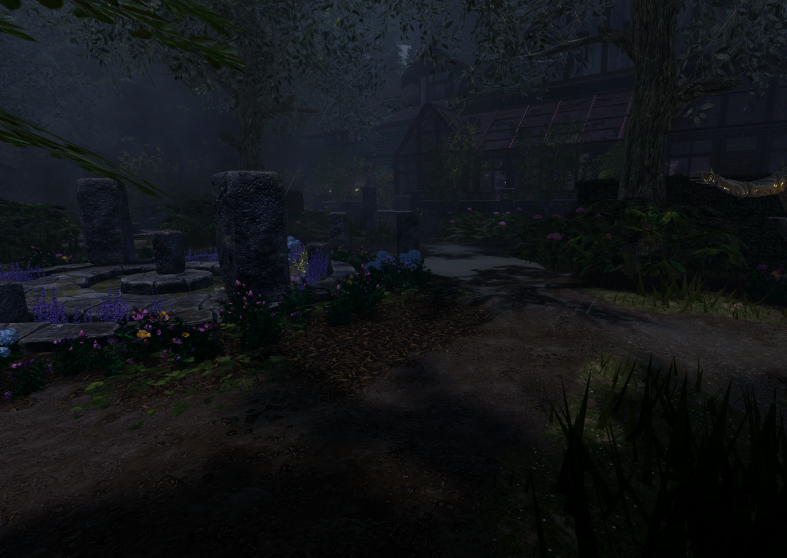
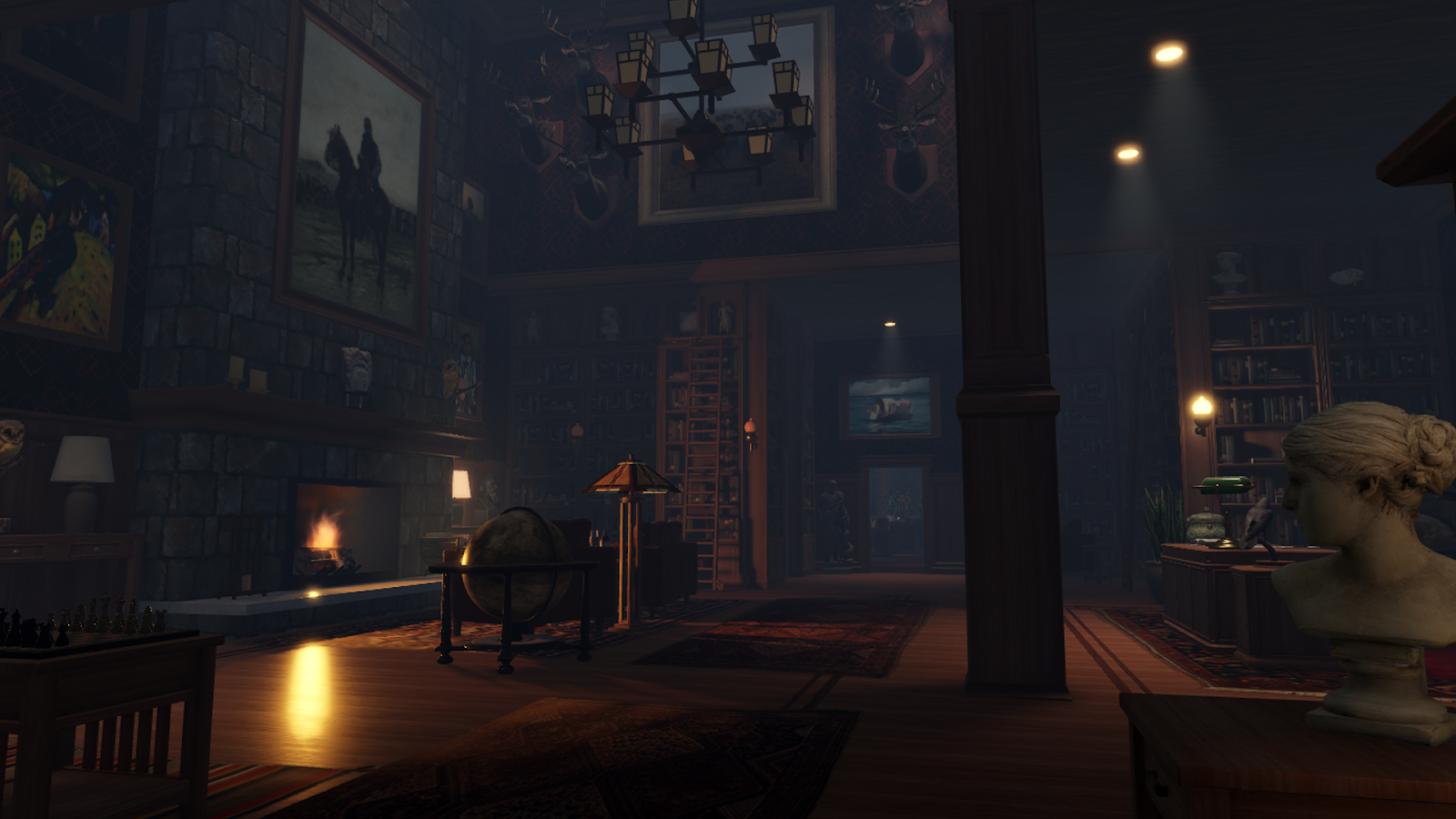
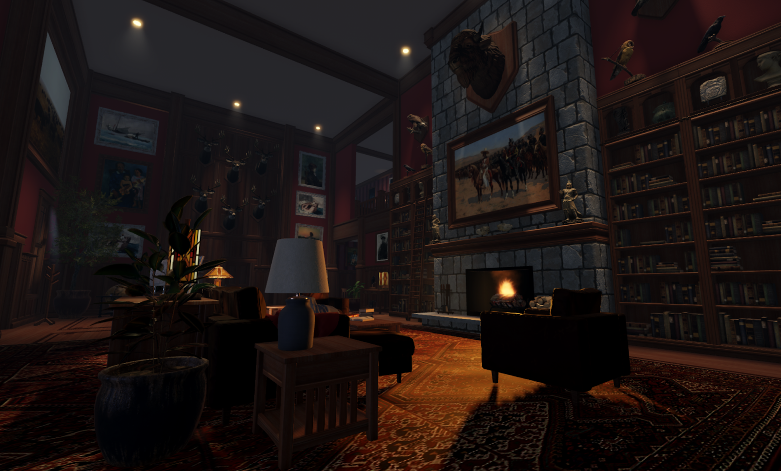
We use materials and surface appearance objects to create an immersive and realistic indoor and outdoor environment. Without materials, this scene could still have some interesting depth, silhouettes, and lighting, but with our materials and texture systems, we can really bring the room to life and add a dimension of realism to the world.
These physically-based rendering (PBR) materials are what makes surfaces like wood look, react, and reflect the way wood does in the real world. In this section, we will go over some of the decisions and processes we went through to create the palette of materials used in the demo. As in the Beyond the Dark demo, we wanted a realistic look and feel for our materials and we achieved it through a few different approaches.
You can break down the process of building all our textures and materials into three areas:
- Surface appearance objects for 1:1 or unique materials for meshes, such as a marble statue.
- Surface appearance objects for shared trim maps for MeshParts, such as repeatable wood trim details on furniture.
- Material variants for shared materials on Parts or terrain, such as flagstone replacing cobblestone for both fireplaces and ground.
Plan, reuse, and budgets
When starting any project, give some thought about material art direction for consistency and reuse. Every platform and device has a limit on the amount of memory you can use for textures so some upfront planning goes a long way to help keep a handle on the number of textures in your experience.
When considering the look and feel of the experience, we deliberately chose to go with a craftsman style house to ensure we could reuse a handful of materials over a wide array of assets, from small picture frames and furniture to large architectural elements.
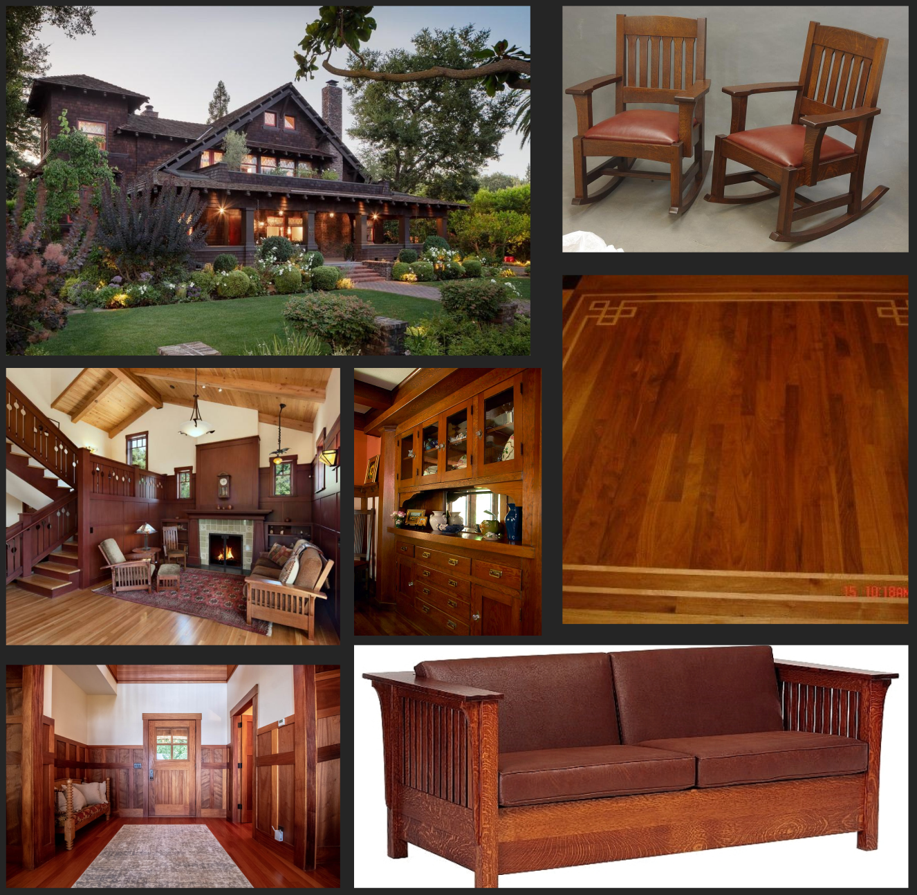
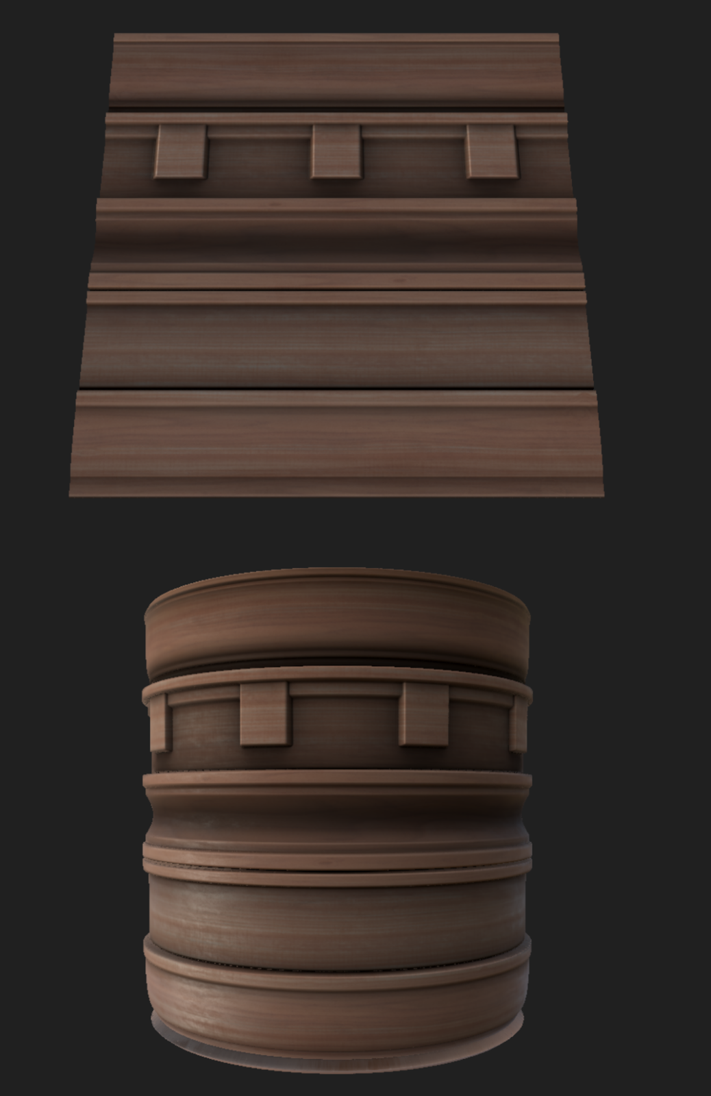
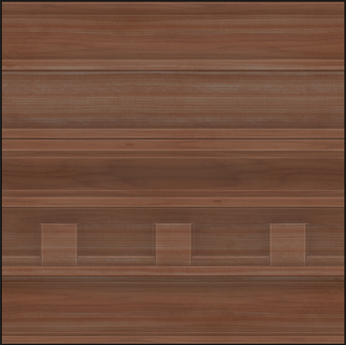
Distilled down to its basics, American Craftsman characteristics include simple, clean lines and natural wood tones, letting the wood and artistry of the carpenter take center stage. These characteristics allow us to use one set of wood trim texture maps for furniture and architectural elements in the house and also allow us to keep our models fairly low poly. With this in mind, we set out to create the trim map texture set you see below.
Surface appearance and trim maps
Trim maps are simple repeatable textures that can be applied to a wide variety of assets. Trim maps do a lot of heavy lifting in experiences and fill the gap between completely tiling textures and creating a 1:1 texture set that you would get from painting an object in a program like Substance Painter or using photogrammetry. The wood material shown previously was set up as a trim map which means that it could be reused on many different meshes, each mesh taking advantage of the same trim textures just by laying out its UVs creatively.
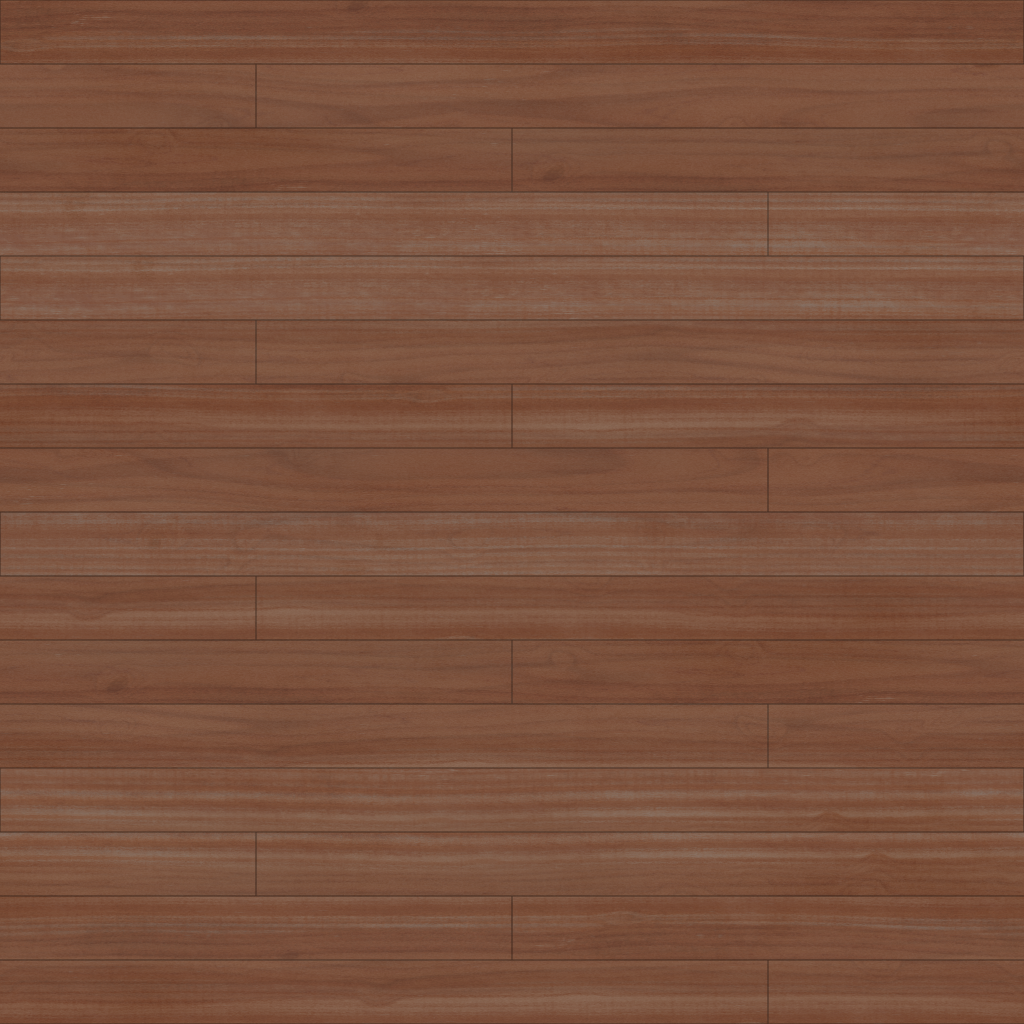
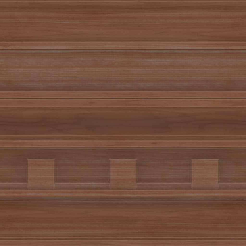
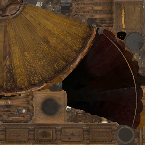
When using trim map texture sets for use across a large variety of scales and objects, try to keep your textures fairly clean and free of details that would be easily recognizable as repeating.
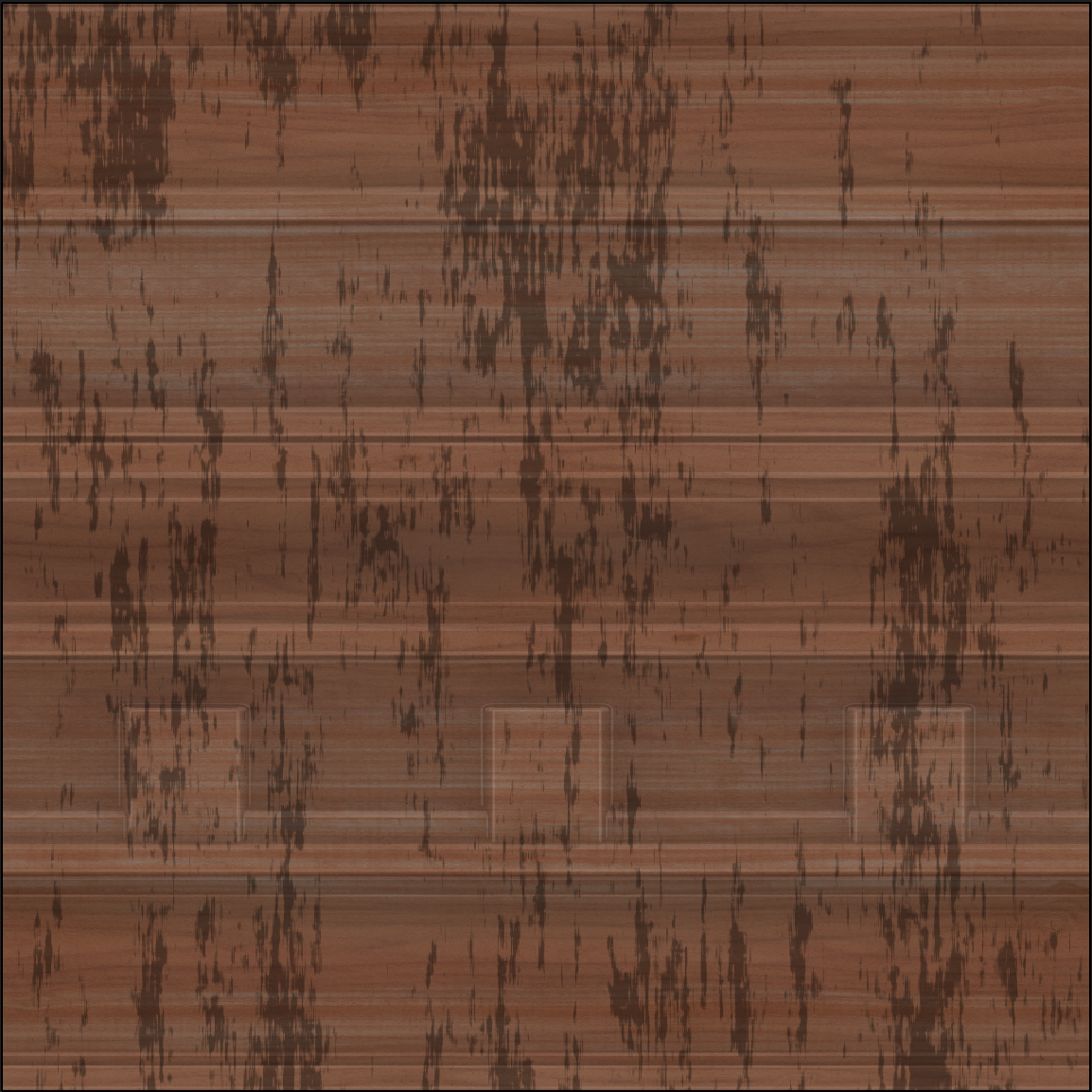
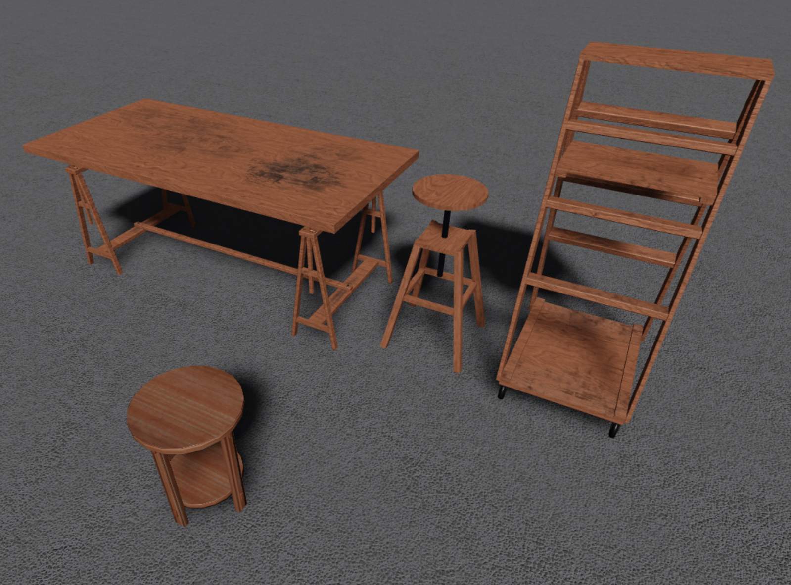
For an example of over-detail, say we wanted to add some grime to our BaseColor map. Look how quickly you start to notice the unrealistic direction of textures and stretched UVs.
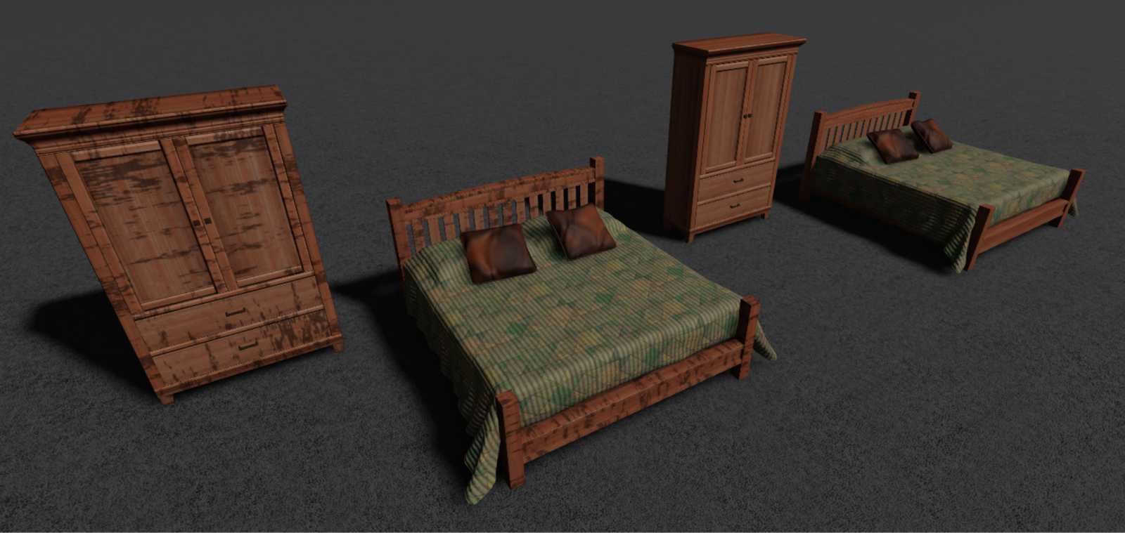
If an asset really needs heavy staining, wear, and/or dirt buildup it would be better to use a 1:1 map unique for that specific mesh. For additional information on working with trim maps, see the Create trim sheets section in the Beyond the Dark documentation.
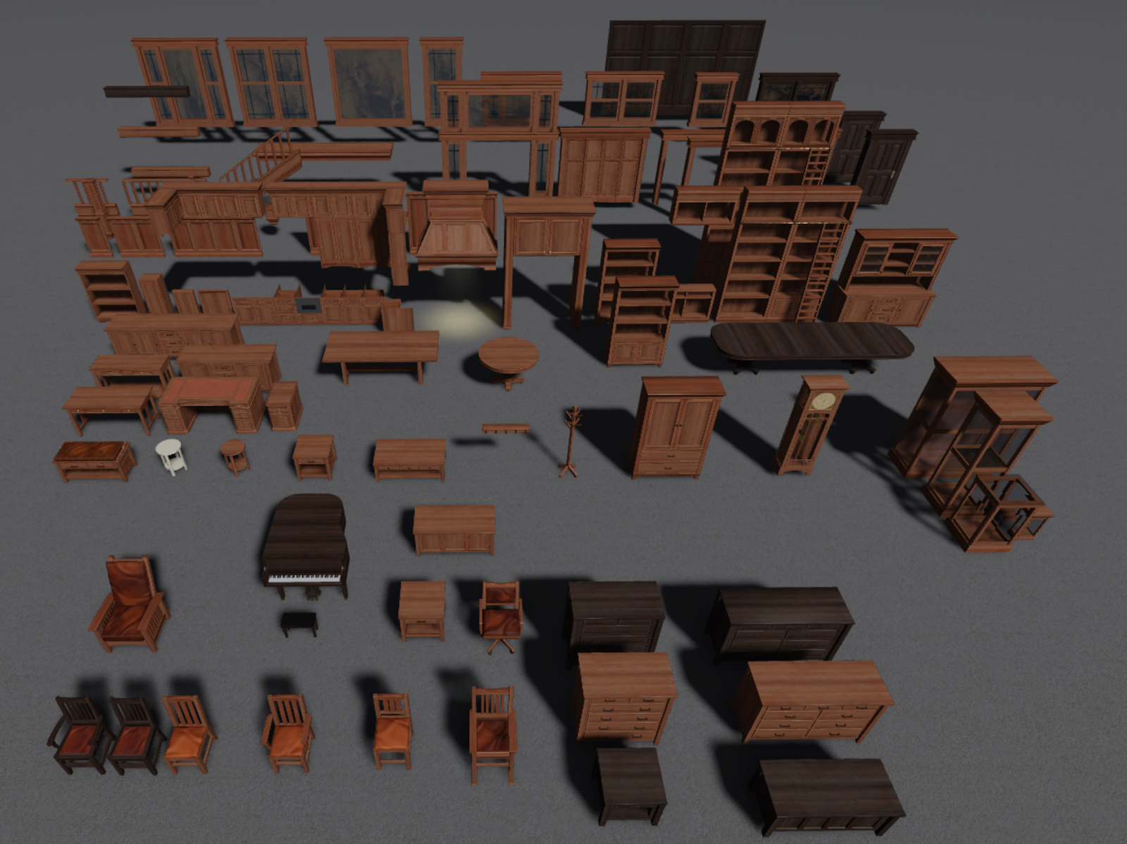
You can package a single Surface Appearance node with these trim maps and apply the trim to all of the assets shown below.
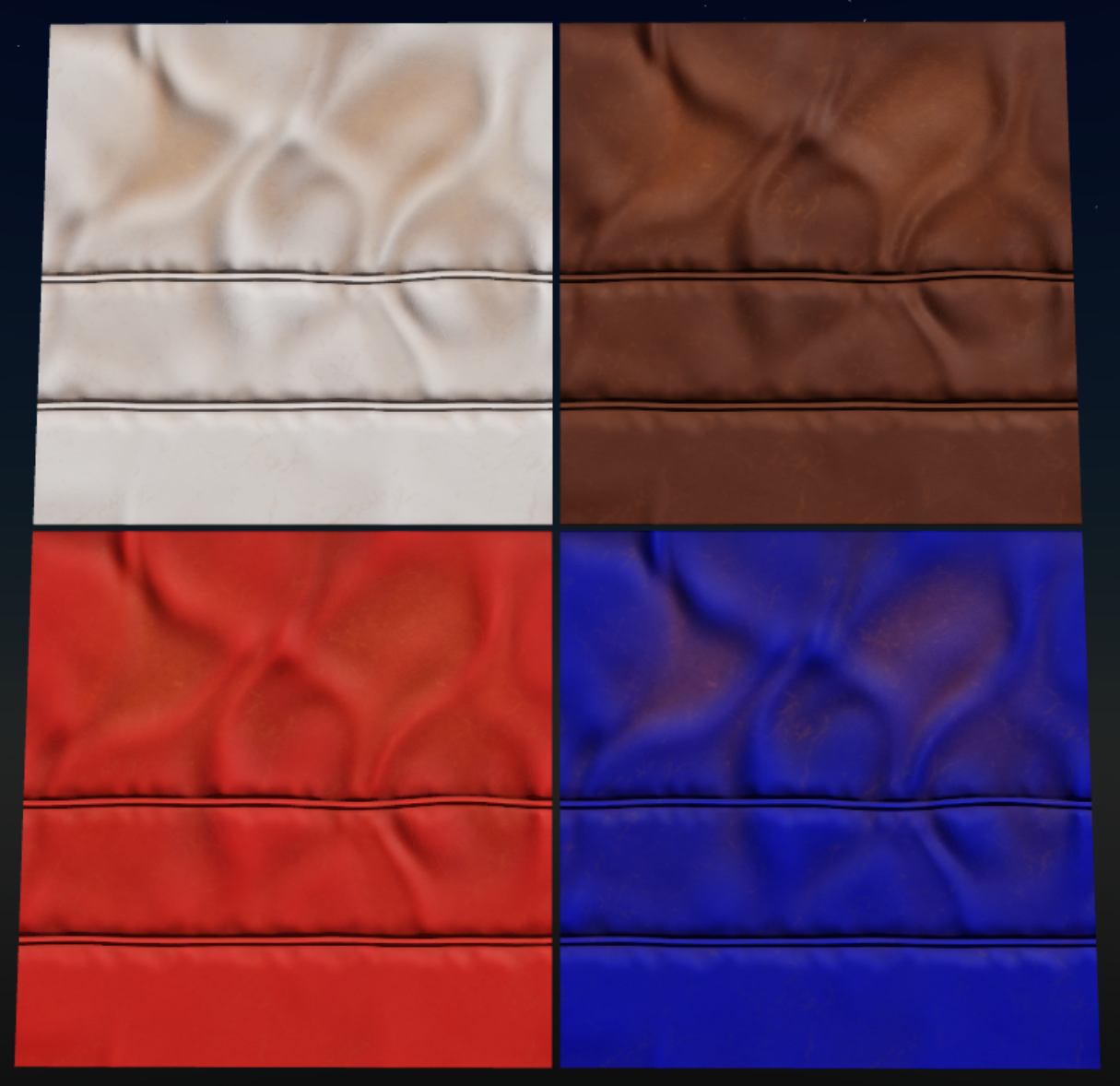
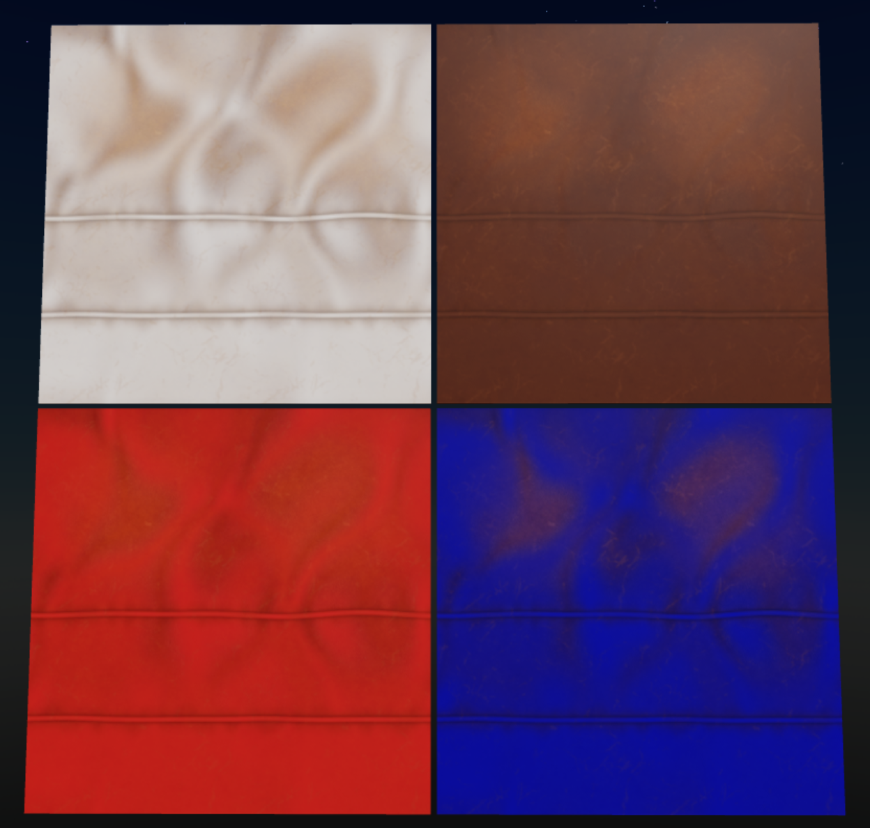
Tinting is another way to make your Surface Appearance nodes and Material Variants go further. By adding an alpha mask to your SurfaceAppearance.ColorMap and setting the SurfaceAppearance.AlphaMode to Overlay, you can use BrickColor or Color3 to tint your objects for visual variation.
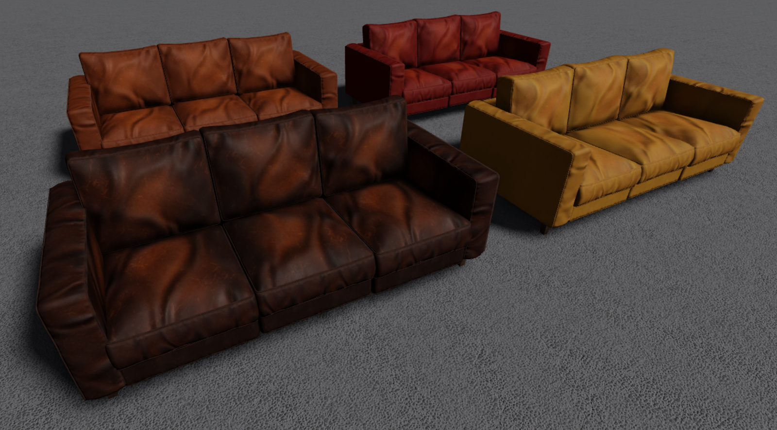
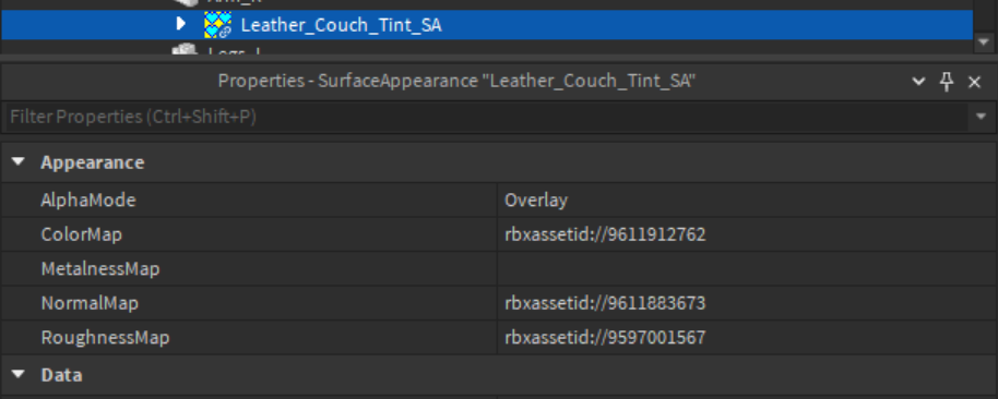
Alpha masks, regardless of how they are created, are merged in your SurfaceAppearance.ColorMap, changing it from a standard RGB texture to an RGBA. You can play around with values and levels in your alpha mask to get the desired level of tinting, but with a little finesse you can achieve some great results.
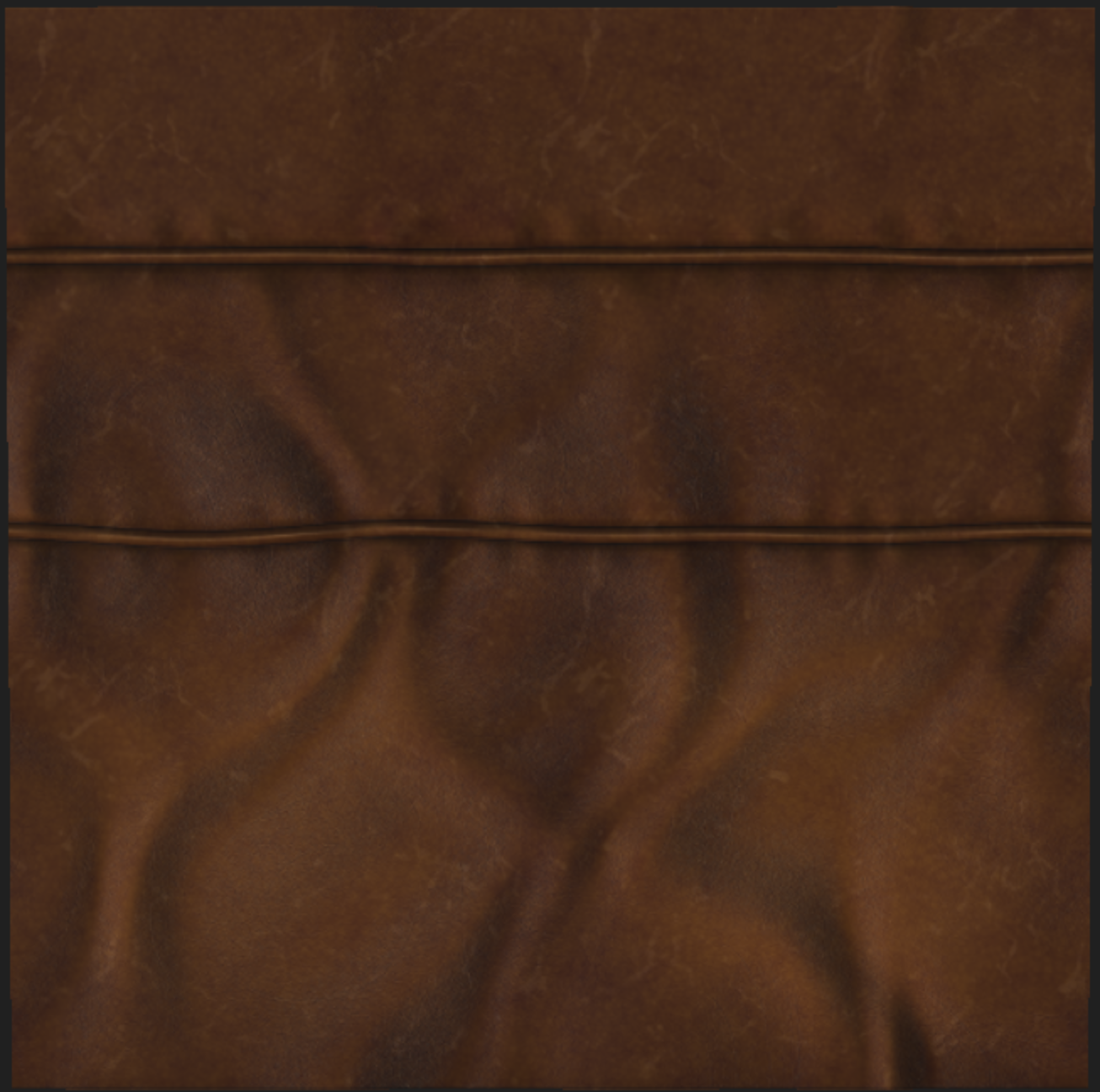
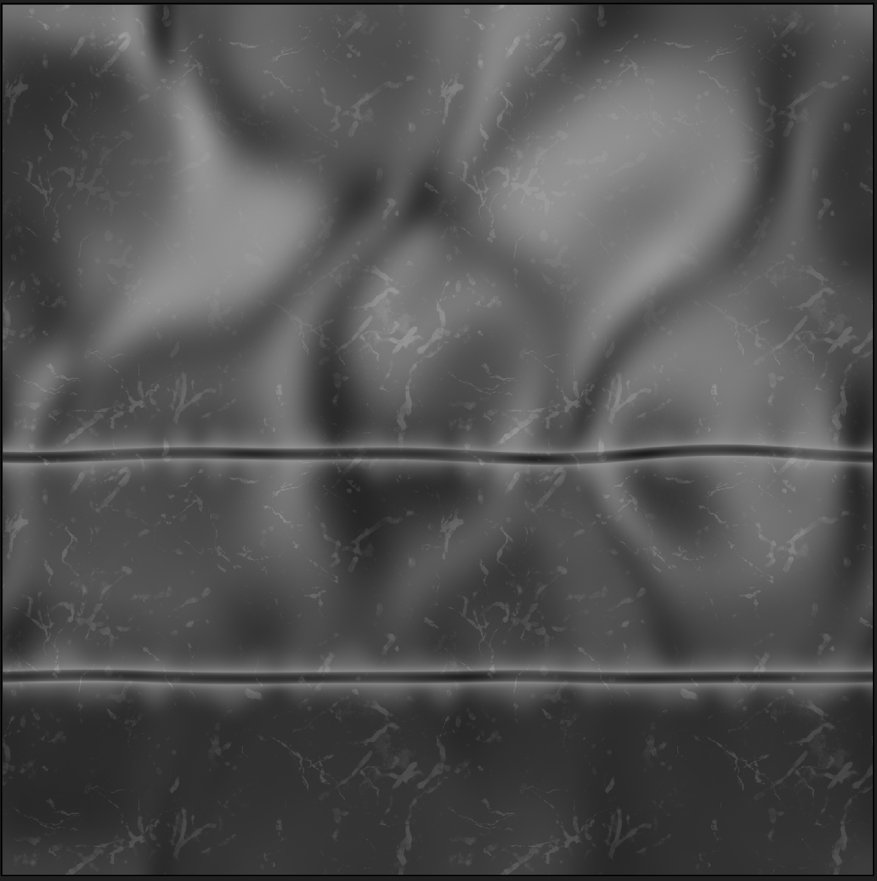
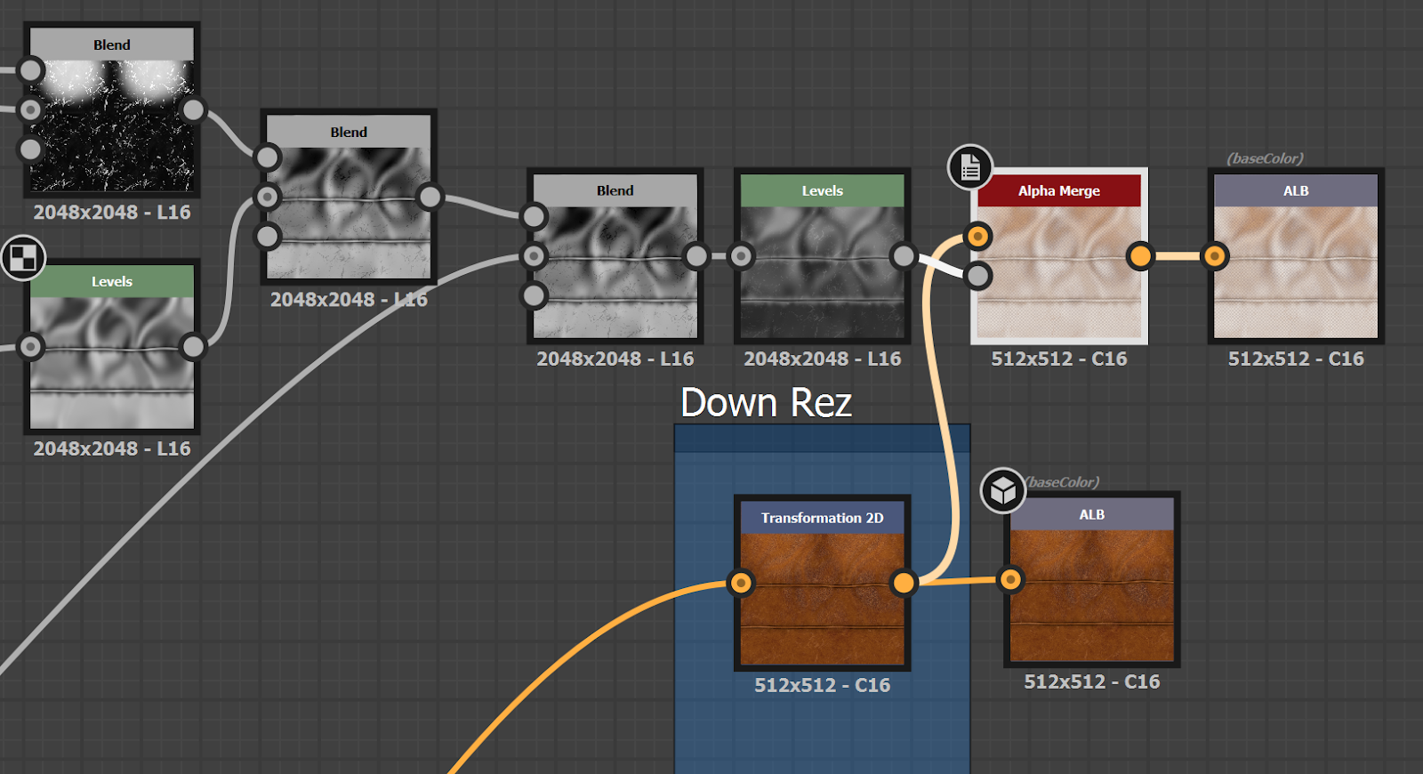
In this leather example, we just blended the height map with some scratches and wear marks to create our alpha mask.
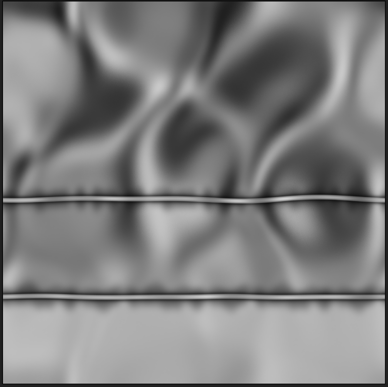
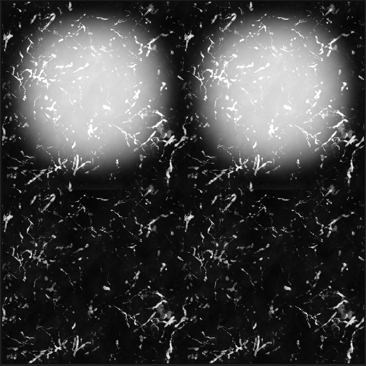
These two maps were then sent to an Alpha Merge Node to create the final RGBA used in the Overlay Surface Appearance Node.
Texture sizes
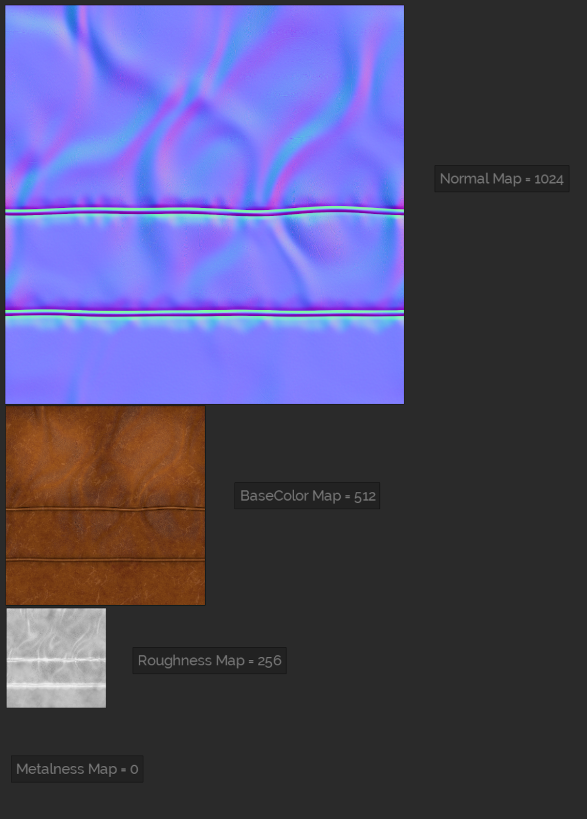
Along with heavily reusing textures, you can apply other techniques to keep your texture memory usage down. You can reduce texture sizes based on usage. For example, you can often drop the resolution of your Surface Appearance object's SurfaceAppearance.ColorMap, SurfaceAppearance.RoughnessMap, and SurfaceAppearance.MetalnessMap down by 1 or 2 times without losing any visual fidelity. Many times the SurfaceAppearance.MetalnessMap can be left blank, which results in a pure black/non-metallic surface.
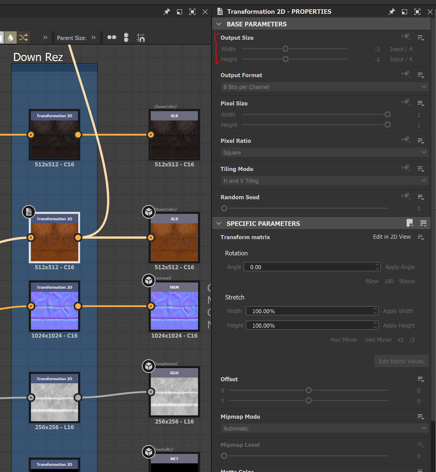
In Substance Designer, the easiest way to resize outputs is to add a Transformation 2D node just before your final output node and adjust the Output Size within the Base Parameters section for that node.
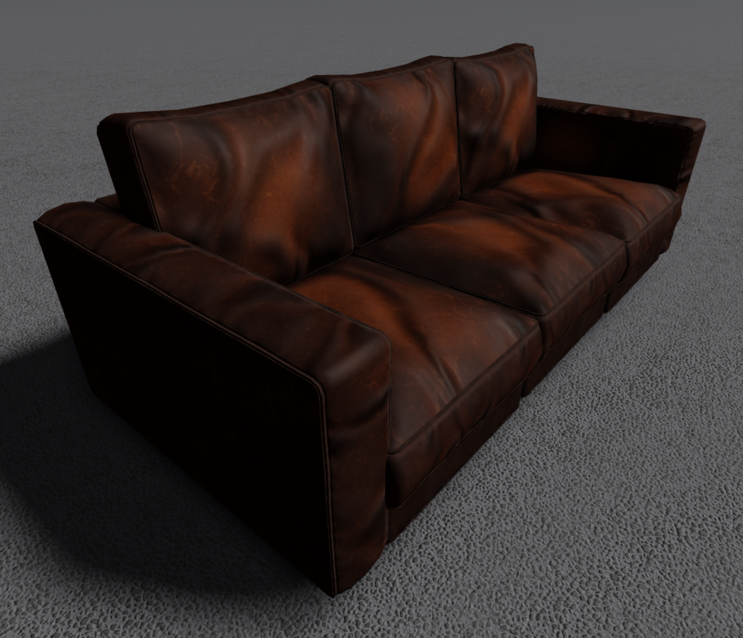
It generally takes several iterations of resizing the various maps in your texture set and visually inspecting the asset in Studio to get them to a spot where they hold up well enough across the variously sized assets. Using this process, you can settle on the smallest texture sizes you feel you can get away with without losing the visual quality needed for the art direction of your experience.
With these few techniques you can keep your texture budget under control and still have a beautiful experience.
Base materials
Since we used parts, terrain, and meshes side-by-side in this demo we chose to utilize the default built-in materials, Material Variants, and the newly released Material Manager tool to ensure our various parts and terrain surfaces match the look and feel of our PBR-textured meshes.
Base materials are available for use as-is or to modify as a new variant. In many cases, the wood base materials serve us very well and only require adjusting the color to match our textured meshes.
Material variants
Since the experience includes an outdoor environment during a downpour, we knew we wanted our ground to feel wet and muddy to match our stormy pacific northwest art direction. We accomplished this by creating a handful of new Custom Materials using Material Variants that we could override the base materials with. We use them to paint down things like mulch, large and small gravel, mud, as well as a shallow puddled version of each.
Material Variants allow the user to redefine textures that are used for any given default material, adding a lot of opportunities to customize materials used in terrain and parts.
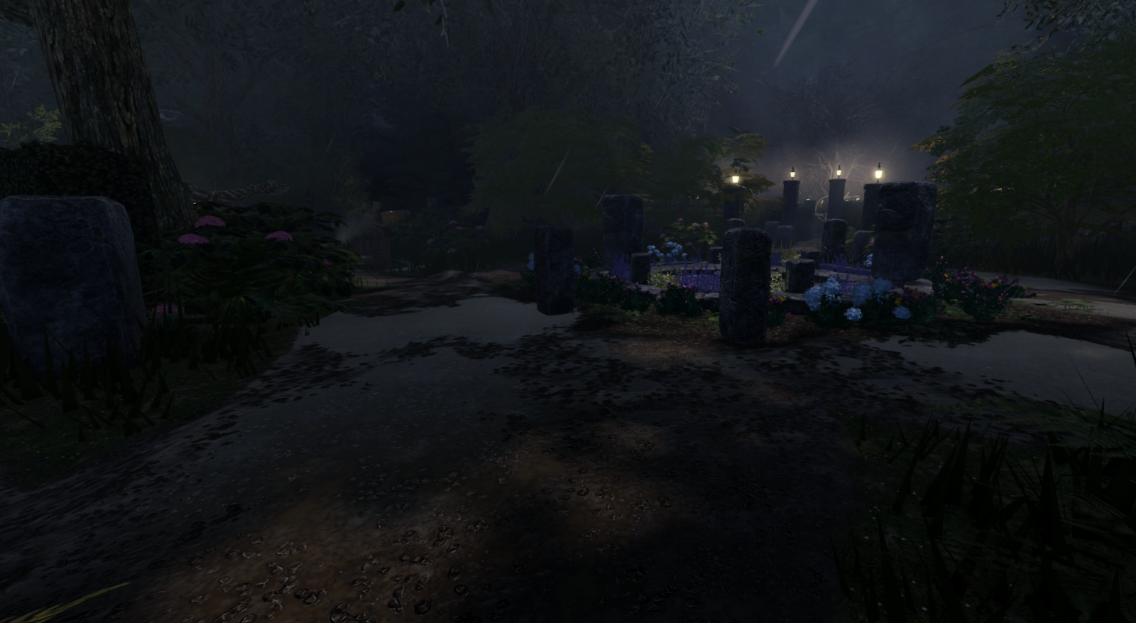
Material Variants are also used to create wet and dry versions of our materials. This is helpful for surfaces such as concrete and our flag stone hardscape that would be dry under cover of the porch roof and wet when exposed to the rain out in the yard.
Creating a Material Variant can be done inside the Material Manager. As the name suggests, the Material Manager also allows you to manage both default and material variants in one place.
Creating a Material Variant is very straight-forward. Let's start with opening up the Material Manager located under the Model Tab.

Once the Material Manager is open you will click the Circle Plus button in the upper left of the window to edit and add a new Variant. When adding a name, it's a good idea to add a suffix of _MV after your name so you can easily pick out the new material variant from the default materials.
Choose a Base Material that most closely relates to your new material. You can think of the Base Material field as the Physical Properties of the material, which affects things like friction, density, weight, hit effects, and footstep sounds.
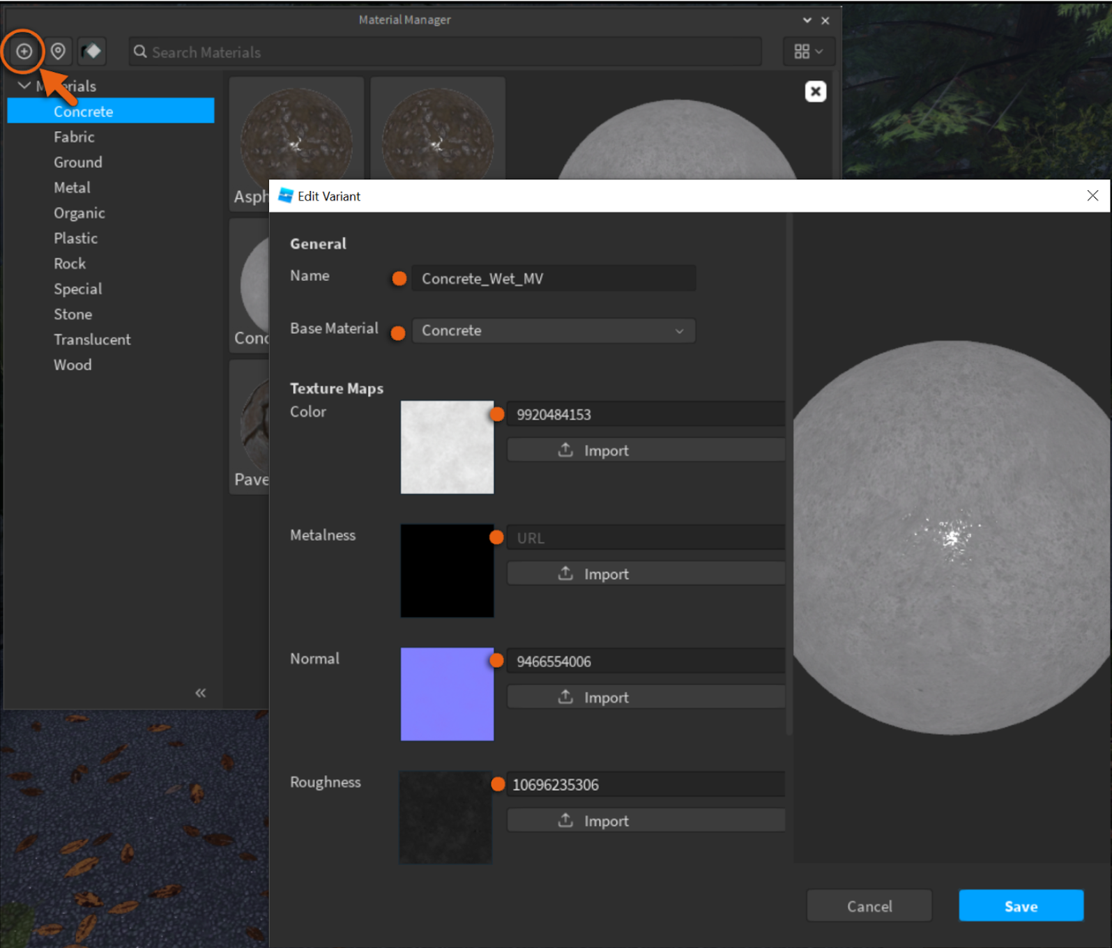
Why create a Material Variant? Material Variants that override a Base Material inherit all properties of that material, except for the visuals. This means your material variant will inherit the physical behaviors of the default material, such as density. It also means future additions, like adding unique acoustics to concrete, will automatically be inherited. In this case, we want to create a new wet concrete variant that inherits nearly all the properties of the concrete material.
If the Base Material relates to the Physical Properties then the Texture Maps are our Visual Properties. Texture Maps tell the renderer how light should interact with the material through our PBR rendering pipeline. The Base Material field also defines what default material is overwritten with the new visual properties. In this case, we are proceeding to overwrite the Concrete base material.
Now that we have created our new "Concrete_Wet_MV" we need to override the default Concrete material with it so that we can use it in our scene. To do that just click on your new MV and click on the Set Override toggle.
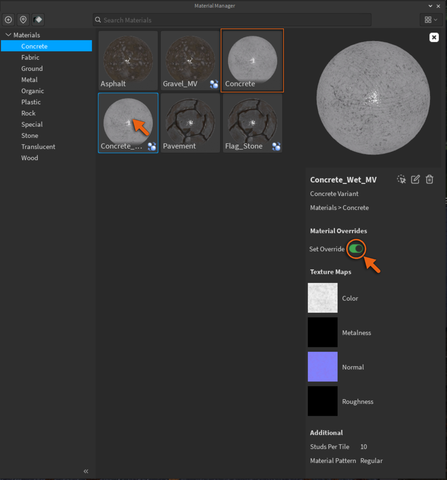
Now everything that uses Concrete in your scene will now be using the new override, including any concrete that you might have painted down on your terrain. The only exception to this is parts that have a specifically listed "material variant" on that object.
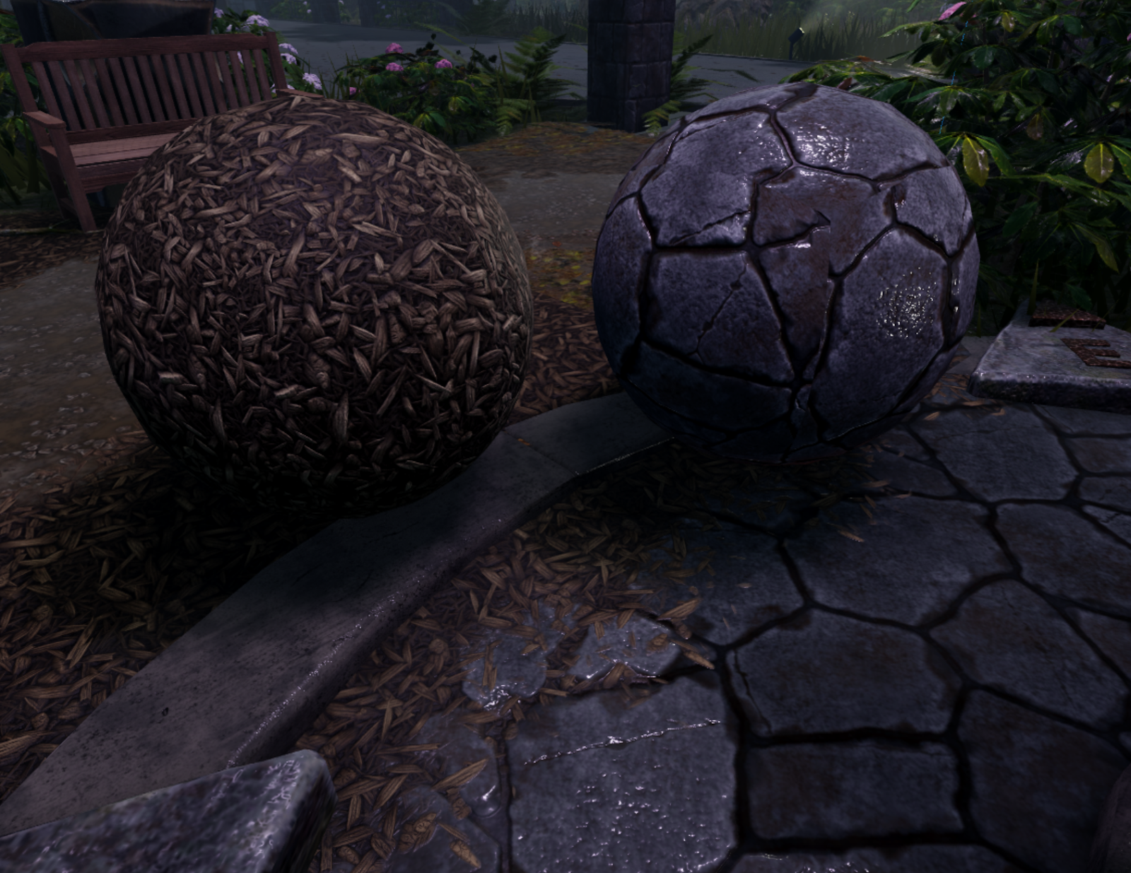
To allow our terrain to have a variety of surfaces, including both wet and with puddles, we ended up overriding about 10 of the default materials. This was necessary for the rain soaked look we were going for on our final terrain.
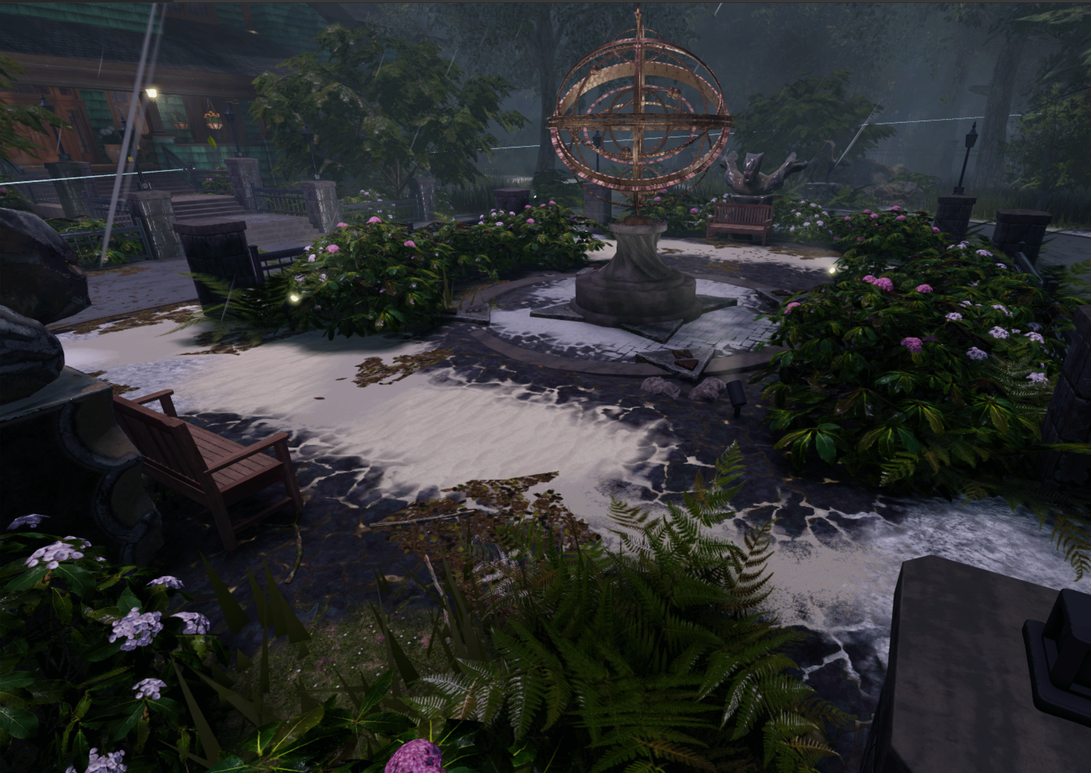
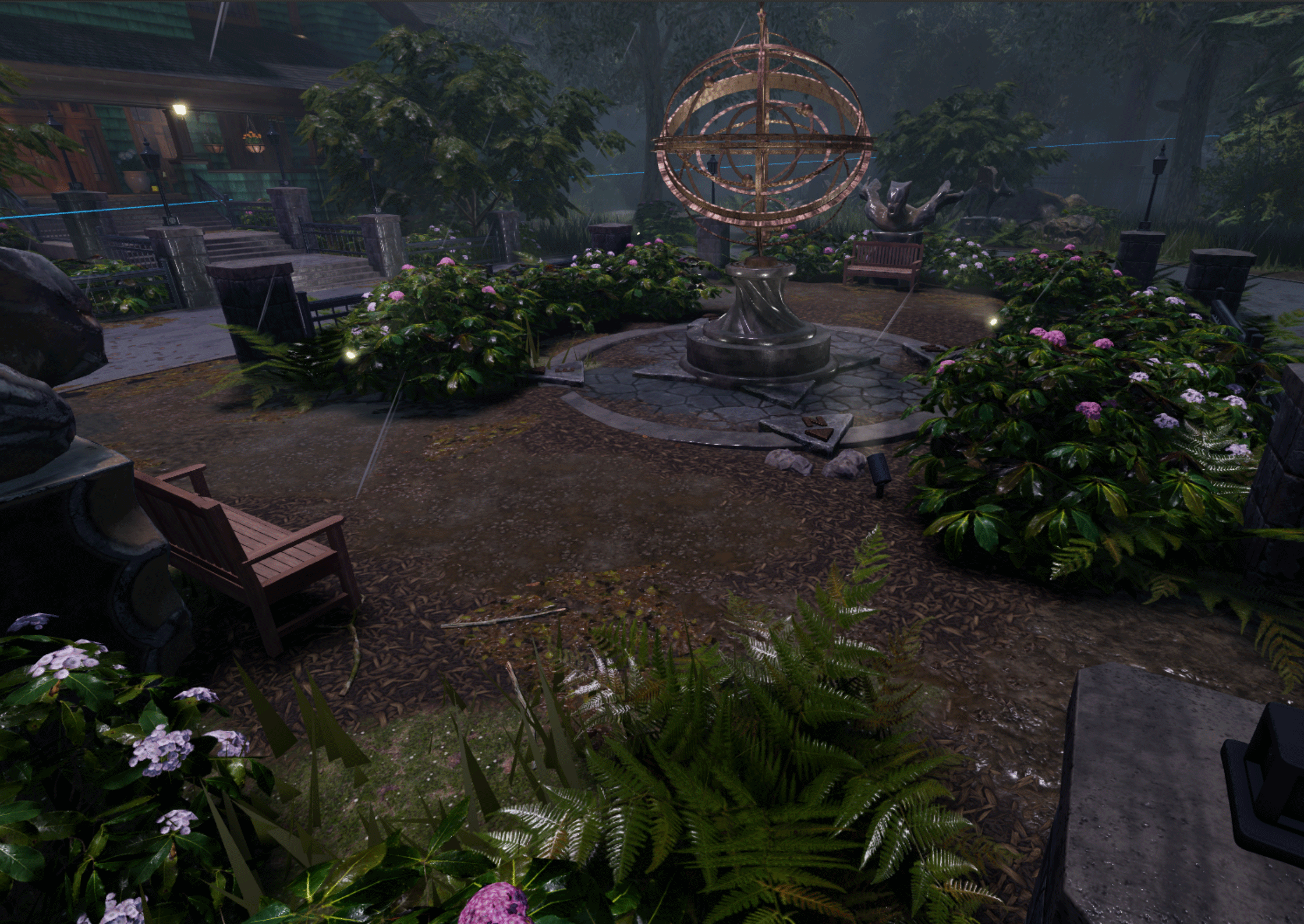
Using all the material options and tools at hand, the possibilities of what you can create are limitless. With a little forethought and planning upfront, you can create awe inspiring materials all while keeping your experience textures under budget.
