了解其他玩家的情况可能很有趣。ProfileCard 开发者模块 是在游戏中查看其他玩家更多信息的好方法,从获得的徽章到玩家最喜欢的游戏。
模块使用
安装
要在游戏中使用 ProfileCard 模块:
从 Studio 的 窗口 菜单或 主页 选项卡工具栏中,打开 工具箱 并选择 创作者商店 选项卡。
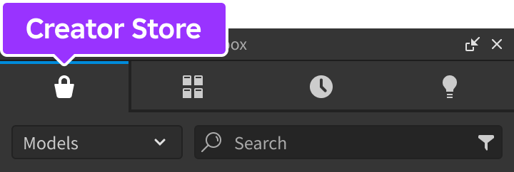
确保选择了 模型 排序,然后点击 查看所有 按钮以查看 类别。

找到并点击 包 瓦片。
找到 个人资料卡 模块并点击它,或将其拖放到 3D 视图中。

在 资源管理器 窗口中,将整个 ProfileCard 模型移动到 ReplicatedStorage。运行游戏时,模块将开始运行。


视图
个人资料卡有不同的视图,具体取决于您是查看自己的卡片还是其他玩家的卡片。
当您首次进入游戏时,角色上方会出现一个图标。点击该图标会打开个人资料卡视图。一旦卡片关闭,图标会消失,但您可以随时通过点击角色重新打开卡片。

查看自己的卡片时,它的显示方式与其他玩家看到的相同,除了任何空白输入会显示占位符文本。此外,状态字符串会受到 文本过滤 的影响,因为任何自由文本输入都应如此。


API 参考
函数
configure
configure(config: table)
通过 config 表中的以下键/值覆盖默认配置选项。此函数应从 StarterPlayerScripts 中的 LocalScript 调用。
| 键 | 描述 | 默认值 |
|---|---|---|
| alwaysOnTop | 如果为 true,则在所有内容上方显示定位图标,防止被 3D 世界对象遮挡。 | true |
| showPersonalIndicator | 如果为 true,则在玩家首次加入游戏时显示个人指示器。 | true |
| showBlur | 如果为 true,则在玩家进入编辑模式时显示模糊的屏幕背景。 | true |
| maxClickDistance | 点击角色时,卡片在相机视点的最大距离,以 studs 为单位测量。 | 100 |
| backgroundColor | 卡片的背景颜色(Color3)。 | [228, 255, 255] |
| backgroundTransparency | 卡片的 backgroundColor 的透明度。 | 0.2 |
| isScaled | 如果为 true,则自动缩放文本的大小以填充空间的高度。 | false |
| isTruncated | 如果为 true,则自动隐藏字符串的末尾部分,这些部分在正常查看时会过长。 | true |
| hasRoundedCorners | 如果为 true,则卡片的角会变圆。 | false |
| cornerRadiusValue | 如果 hasRoundedCorners 为 true,则为 UICorner 的角半径值。 | 20 |
| hasBorder | 如果为 true,则显示卡片的边框。 | false |
| borderColor | 卡片边框的颜色(Color3)。仅在 hasBorder 为 true 时适用。 | [228, 255, 255] |
| borderThickness | 如果 hasBorder 为 true,则卡片边框的厚度。 | 3 |
| borderTransparency | 如果 hasBorder 为 true,则卡片边框的透明度。 | 0 |
| borderLineJoinMode | 卡片边框的角样式(Enum.LineJoinMode)。仅在 hasBorder 为 true 时适用。 | Round |
| headerFontSize | 卡片标题的字体大小。 | 18 |
| headerFontType | 卡片标题的字体类型(Enum.Font)。 | GothamBlack |
| textFontSize | 卡片正文文本的字体大小。 | 15 |
| textFontType | 卡片正文文本的字体类型(Enum.Font)。 | GothamMedium |
LocalScript
local ReplicatedStorage = game:GetService("ReplicatedStorage")

local ProfileCard = require(ReplicatedStorage.ProfileCard)

ProfileCard.configure({
	alwaysOnTop = true,
	maxClickDistance = 50,
	backgroundColor = Color3.fromRGB(0, 0, 0),
	backgroundTransparency = 0.4
})